

eddypeck
Member
First off this inappropriate message on the back of a B&Q lorry
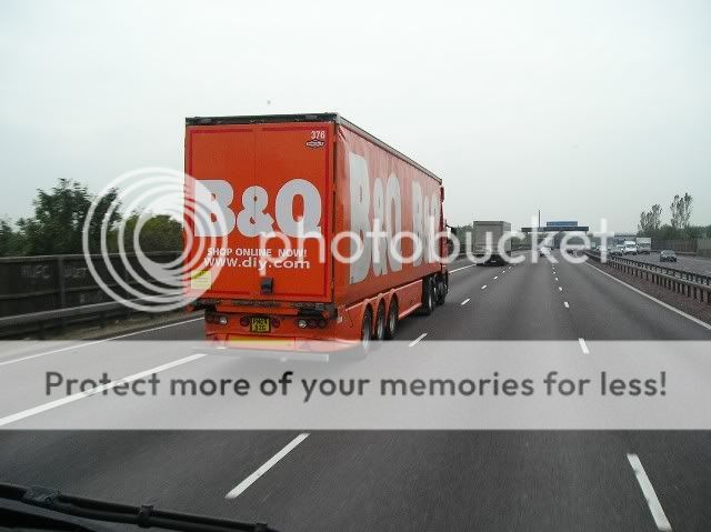
If I "Shop online now" I'm likely to crash, not to mention it will be illegal.
And just to clarify I didn't take this picture, I was riding a motorbike but googled and found this image.
secondly this spelling/gramatical balls up by Royal mail:
Royal Mail Parcels
“We’re make e-tailing easier....†I'm guessing it's supposed to be “we make...†or “we’re making...â€