(Gentle!) critique/help please ..

Stoo1701

Member
Hi guys,
Been slaving away over this logo for the business I've just started, Dragon UAV (aerial photography/videography).

I've used simple fonts so as not to make the design too fussy, but to me it seems finished.. Ok not up to the standards of some of you amazing artists, but it's my 2nd logo, it's took me about 8 hours and for those who notice, yes it's LOOSELY! based on the Kali-Linux dragon..

Any advice would be appreciated !
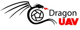
 

Attachments

  • image.jpeg
    image.jpeg
    269.8 KB · Views: 30
I don't know what your definition of 'loosely' is, but I would be very worried about using that as a professional logo. I would say
it's about the standard of an A Level student.

Putting the plagiarism aside, it's ok, but why not just spend a couple of hundred quid for a professional designer to spend a few
hours to come up with something a lot better.
 
Wardy, I'm trying to start this business on a real shoestring here mate, which is why I wanted to have a crack at it myself.. What makes it 'A-level'? How could it be elevated?

Hankscorpio, how could I change it enough so it would be far enough away from the original?

If I can get to A-level in my second ever logo in 8 hours, there must be more work I can do to get it closer? Maybe HND level?
 
I shouldn't really say this, but just find a really nice dragon on a stock illustration site for a few quid, lose the shutter, beef up the
Dragon text and line it up with UAV and it will be fine. :)
 
You're not a designer, so don't spend all your time designing the logo. Just whack the name in a nice font for now and move onto something that earns you revenue. Once you're profitable you can hire someone who knows what they're doing to brand the business for you.
 
The critiques so far have been bang on, I couldn't of said it better myself. I think Wardy was being kind with his A-level standard comment, as honestly, a secondary school student could of ripped off the same dragon and typed some text next to it, as that is exactly what you have done, in fonts that no designer would of used. Sorry if that has come across a bit harsh, but that is as gentle as I could have critiqued this. I could of said a lot more.
 
Thanks Wardy, the shutter was to try and convey the photographic element, if I remove it how can I get that across? There are more attractive aperture vectors granted.. I did find another stock dragon vector that could be X flipped to look forwards, I'll link it below... Again with the round centre to use to try and convey the photo part.. I just can't think how to achieve it another way.

I did think of just having some form of mixed dragon eye/aperture in the O of Dragon, and just leaving it as that (k.i.s.s.)

Rebranding a business after it's been running can have detrimental effects, I'd rather avoid that but I would have it improved down the line by one of your good selves !

Thanks for the adv so far tho guys, I'm not trying to get a free ride out of you, but I've got four kids & was made redundant., a 'couple of hundred quid' may as well be a couple of thou right now.. Just trying to do as much as I can
 

Attachments

  • image.jpeg
    image.jpeg
    29.9 KB · Views: 15
The critiques so far have been bang on, I couldn't of said it better myself. I think Wardy was being kind with his A-level standard comment, as honestly, a secondary school student could of ripped off the same dragon and typed some text next to it, as that is exactly what you have done, in fonts that no designer would of used. Sorry if that has come across a bit harsh, but that is as gentle as I could have critiqued this. I could of said a lot more.

Well indeed pal, you are the almighty in this regard etc etc. It's my second logo, I don't need to be told it's crap, that's why I came here in good faith to seek some guidance. The fonts are temps, they aren't really the subject. I haven't just cut/pasted the dragon, but I have tried to learn illustrator at the same time as have never used it before. But thanks, your 'critique' is really constructive and useful, and shows the community spirit I've seen in every other forum I ever joined, doesn't come over as self-righteous chest beating at all.. Honest.

I could have said a lot more.
 
You're not a designer, so don't spend all your time designing the logo. Just whack the name in a nice font for now and move onto something that earns you revenue. Once you're profitable you can hire someone who knows what they're doing to brand the business for you.

I would listen to what Paul has suggested, you are better off taking the time to find a really nice font that you can purchase at a reasonable price, or possibly even a free font that has a commercial free license. If you wish, maybe then incorporate your aperture maybe angled above your brand name in order to depict a camera hovering effect (aerial photography/videography). Keep things as simple as possible for yourself at this point, you'll get better results.
 
Reading their terms - you can of course use it for your logo when buying the correct license.

I agree - concentrate on making the business profitable, and work on the logo and branding as a next phase.
 
I feel for you Stoo.

That dragon could work, but with a better shutter in the space. It's just that shutters are so obvious, but
I know there's no other alternative. Could you just put 'photography' in small caps under UAV?
 
Honestly, I'd lose the dragon 'infatuation' and just do a nice clean typographically based design using text only for 'your first branding'. It will be much easier for you to work with and arguably more in keeping with the current trends.

Also if you ever need to watermark your work it will work a lot easier than trying to sling a huge dragon in the corner etc, don't just look at the 'branding' on business cards, you need to look at other areas where you may need to brand as well, things like dvd/usb/blu ray, cases etc. Sometimes keeping it simple is a much better way of doing things.
 
Indeed I seem to be far down this dragon path. My brief to myself was simple two colour, recognisable at different sizes and to get across visually the idea of photography and flight in keeping with the name.

I know bugger all about the professional considerations, but I can see how the simpler typography might be a better way to go... So..

1) is it not important for a logo to convey its own meaning? Ie are the benefits of a simple type logo worth losing the visual element?

2) is it not a bad idea to rebrand down the line off poss to avoid loss of the brand recognition that has been built?

3) how about simple type in a nice font(what constitutes a 'nice' font under these circumstances? Are there trends? And if dragon and UAV are in different fonts (surely a better idea) are there certain 'paired' fonts that go well together visually for this?

4) finally ! What if I held on to a tiny bit of dragon infatuation (? It's my name! ??) and stylised the O to be a more attractive aperture/eye type thing with some wings in either side ? Coming off the O at around 10 O clock and 2 o clock, in a simple rib style like on the logo above? If I could get that right, I don't think I would need to rebrand, and it's simple & type based with just a smidge of graphic?
 
1. No, the McDonalds 'M' doesn't say "burgers and fries" (well you can argue that it does now, but not literally)

2. What brand recognition do you have at the moment. If you do good wok and provide consistent results then what you use for your branding won't really matter too much. Those values and aspects of your service ARE your branding.

3. https://designschool.canva.com/blog/the-ultimate-guide-to-font-pairing/ Just keep it simple. Don't opt for fancy styles, just clean and simple and you can't go wrong. Post here and we'll advise.

4. There's no reason why you can't add some dragon elements somewhere. My point originally was that your brand is the reputation you have. A logo and some colours help people identify your business, but they're not essential for a successful business. I knocked up a logo for a mate a while ago in about 5 minutes;
yparkingspace.png
They didn't need a thought-out logo because they were pushing the business and gaining investment based on their client base and revenue projections, not how nice their logo was. Now their business brings in millions each year and they're constantly pushing for more growth. They grew from 2 guys working on this in their spare time to
employing 17 people in an office at Canary Wharf, and it was all because of their brand, not their branding. In short, focus on doing what you do and getting money coming in. Your logo can probably wait.
 
Wow the advice is really flowing ! Thank you guys, this got so much better than the "your logo is sh*t" comments we started with.. Still think it was ok for a second logo ever & first ever use of illustrator !

I was attached to the dragon, but what your saying makes absolute sense. I'll go down the font route, pretty sure I can manage that !! Will post later when redone
 
Back
Top