You are using an out of date browser. It may not display this or other websites correctly.
You should upgrade or use an alternative browser.
You should upgrade or use an alternative browser.
Thoughts?
- Thread starter _JJ_
- Start date
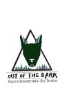
Overall - concept is good and easy to understand.
Smaller details will be lost at smaller sizes, like the roughness of the font at business card size (the holes in the font) - the tree details etc.
Not sure why there's a triangle - but here's a line for you - it represnts the dog, the owner and the trainer in a partnertship to train the dogs (damn I'm good!)
The "A" in Bark encroaches on the lettering underneath - again in smaller sizes it will look awful - and very difficult to embroider etc.
Overall - lose the triangle and the small trees - why not have a large outline of a tree instead (you get your triangle and trees in one).
And ditch the grunge font for a more solid font for easier application across different mediums, and space out the text so there's room to breath.
I'd also make the last line as long as the "Out of the Bark" and scale it up to the same width.
Awesome suggestions thank you for themOverall - concept is good and easy to understand.
Smaller details will be lost at smaller sizes, like the roughness of the font at business card size (the holes in the font) - the tree details etc.
Not sure why there's a triangle - but here's a line for you - it represnts the dog, the owner and the trainer in a partnertship to train the dogs (damn I'm good!)
The "A" in Bark encroaches on the lettering underneath - again in smaller sizes it will look awful - and very difficult to embroider etc.
Overall - lose the triangle and the small trees - why not have a large outline of a tree instead (you get your triangle and trees in one).
And ditch the grunge font for a more solid font for easier application across different mediums, and space out the text so there's room to breath.
I'd also make the last line as long as the "Out of the Bark" and scale it up to the same width.
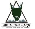
Thanks all! ,yes it’s a preliminary sketch did it in about 30 minutes last night just to get the juices flowing. I’ve added some of your suggestions requests and I totally agree on pushing a little more of a dog look on the head. I’ve rounded a bit on the ears and added a nose instead of a line we do want the head to be graphic. As for the text client is stuck on the text I’ve already tried cleaner fonts for future planning purposes but client does not want to budge… Final concept will have finished fine edges. I appreciate everyone’s thoughts

Levi
Ultimate Member
But would it without the dog nose, I don't think it would.Says "dog" to me now.
Moving in the right direction.
That dog nose doesn't fit with the rest of the design either imo.
DanSilva
Member
It's better but still doesn't look like a dog to me. I think you use too many straight lines, you need more curves(more organic). The nose seems a little bit weird. It's like is not connected with the rest of the design. Also, I don't know what reference did you use, but it seems to me that you draw the inside of the ears in the wrong direction(usually the internal ear(the hole) is facing the outside of the shape for a stereo hearing). Hope that you understand what I mean,
