You are using an out of date browser. It may not display this or other websites correctly.
You should upgrade or use an alternative browser.
You should upgrade or use an alternative browser.
work in progress
- Thread starter steadman
- Start date
LovesPrint
Member
Can you give us a bit more background? what's the brief and purpose of them?
Ozwaldo Sanchez
Member
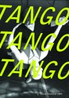
Not knowing the background et al. the middle image has some potential. I'd try:
A different font - something with a bit more flow and eligance, to emulate the movement of the dancers
A different colour - Green is ok, but it looks like a standard pallette choice of an rgb colour in an cmyk document.
A bit of transparency... may be? on the text? ?
The text treatment is a bit static
Hi,Can you give us a bit more background? what's the brief and purpose of them?
You wanted to know the background, basically this is an experiment with typography, that I intend to use to replace some posters in my portfolio. I deceided to create 3 Tango posters, because I wanted to approach the same subject from slightly different angles. I think perhaps they are to much alike.
They are an experient for my portfolo, wanted look at same subject 3 different ways, they are to much alike.Not knowing the background et al. the middle image has some potential. I'd try:
A different font - something with a bit more flow and eligance, to emulate the movement of the dancers
A different colour - Green is ok, but it looks like a standard pallette choice of an rgb colour in an cmyk document.
A bit of transparency... may be? on the text? ?
The text treatment is a bit static
thanks for the critique


