You are using an out of date browser. It may not display this or other websites correctly.
You should upgrade or use an alternative browser.
You should upgrade or use an alternative browser.
Work In Progess, Opinions?
- Thread starter Airwalk Enterprise Inc
- Start date


DougBarned
Member
Hi ")
Looks good in theory, but a few things:
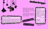
I've attached a screenie for you to see what I'm seeing. Justified text never works nicely on the web. It spaces badly. Consider using left aligned instead.
The news section is breaking out of its boundaries, you need to make that frame able to expand and contract so that the text can change length without breaking it. Same for Definition Of: Ascent Line.
Otherwise, pretty cool!
/Doug
Looks good in theory, but a few things:
I've attached a screenie for you to see what I'm seeing. Justified text never works nicely on the web. It spaces badly. Consider using left aligned instead.
The news section is breaking out of its boundaries, you need to make that frame able to expand and contract so that the text can change length without breaking it. Same for Definition Of: Ascent Line.
Otherwise, pretty cool!
/Doug
Attachments
Airwalk Enterprise Inc
New Member
Thanks Doug, it does however look great in my browser, the lastest of IE, FF, Opera, Chrome and Safari. What browser are you using? It's obviously display text differently my the browsers ive tested on.
Thanks again =]
Thanks again =]
DougBarned
Member
No prob - I'm viewing with Firefox 3.5.7 on Mac 10.6.2.
/Doug
/Doug
Airwalk Enterprise Inc
New Member
Thanks Doug, you've been most helpful. My e-mail is [email protected], add me to msn or look me up on facebook or something, its nice to chat to someone with similar interests lol =]
DougBarned
Member
Always happy to help!
Can't find you on facebook though... oh no.. wait... found you at [email protected] - careful with the typos
/Doug
Can't find you on facebook though... oh no.. wait... found you at [email protected] - careful with the typos
/Doug
Ozwaldo Sanchez
Member
The fonts to download are only windows versions - were are the mac fonts?
Airwalk Enterprise Inc
New Member
The website is clearly still in construction, patience young one!