You are using an out of date browser. It may not display this or other websites correctly.
You should upgrade or use an alternative browser.
You should upgrade or use an alternative browser.
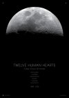
WIP: Love letter to Apollo
- Thread starter thisnorthernboy
- Start date
Paul Murray
Ultimate Member
Cool, although personally I'd adjust the spacing between some of the type.
Paul Murray
Ultimate Member
I wasn't referring to the kerning, more the actual spacing between the lines. Personally I'd move "TWELVE HUMAN HEARTS" up a bit just to give it a little more importance, and I'd maybe also move "3 days..." up a little to separate it from the list below. There's nothing wrong with what's there at the minute, that's just me 
thisnorthernboy
Member
I completely get where you're coming from about the letter spacing - but I really wanted the image to be THE thing for this first poster, and for the type to begin right at the bottom of where the circumference of the moon is. Keeping things quite tight below that suited what I was after. (although as I design the other posters in the series I may go back and tweak.)
Thanks for the comments.
Thanks for the comments.
thisnorthernboy
Member
I think when all three posters are done, I'll see if there's enough interest. I'd love to get them printed on nice heavy black colourplan stock and printed in gloss white or a metallic silver.
