You are using an out of date browser. It may not display this or other websites correctly.
You should upgrade or use an alternative browser.
You should upgrade or use an alternative browser.
WINDOWS FLYER (CRITIQUING NEEDED)
- Thread starter ashamsdesigns
- Start date


Levi
Ultimate Member
Honestly...
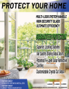
It looks dated, the text on 'the back' especially and in kind of comes across looking 'cheap'. This 'cheapness' can then be implied to the company the work is being done for.
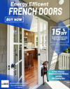
The main image looks like it's distorted and the dog looks like a really bad photoshop
'Protect your home' makes me think of home security rather than 'french doors'
My eyes wander around the design, there is no visual hierarchy imo to guide the viewer to the key points.
Other than that I have no idea if your choice of colours work with the company brand as there are obviously missing logos.
It looks dated, the text on 'the back' especially and in kind of comes across looking 'cheap'. This 'cheapness' can then be implied to the company the work is being done for.
The main image looks like it's distorted and the dog looks like a really bad photoshop
'Protect your home' makes me think of home security rather than 'french doors'
My eyes wander around the design, there is no visual hierarchy imo to guide the viewer to the key points.
Other than that I have no idea if your choice of colours work with the company brand as there are obviously missing logos.
ashamsdesigns
New Member
*Doors Flyer* Not WindowsHello guys, I'm working a door flyer. I'm still a little new with working as a Freelancing Graphic Designer and I wanted to know your opinion on how it could be improved?
Thank you in advance!
ashamsdesigns
New Member
Hello Levi and thank you for all you observations!Honestly...
It looks dated, the text on 'the back' especially and in kind of comes across looking 'cheap'. This 'cheapness' can then be implied to the company the work is being done for.
The main image looks like it's distorted and the dog looks like a really bad photoshop
'Protect your home' makes me think of home security rather than 'french doors'
My eyes wander around the design, there is no visual hierarchy imo to guide the viewer to the key points.
Other than that I have no idea if your choice of colours work with the company brand as there are obviously missing logos.
In regards to the font; which font do you think would work best with this flyer?
I appreciate the observation on the dog and I will definitely fix that.
And, unfortunately I can't change the wording that's what the company prefers, but I see what you mean about hierachy. I think it's what I'm struggling on the most.
Also, as you pointed out about the logo, I made sure to remove it to protect the business' brand.
There's a typo for definite - make sure to do a spellcheck.
There's disharmony in the hierarchy of the information.
And there's no call to action - or at least the call to action is very small.
Your goal is to get the information to the consumer quickly.
And get them to make the call/order.
You've got some good things here in the first one.
Clear headline.
Buy Now (but no indication of how to)
Nice discount highlighted.
Then the text under this is small and illegible from a distance.
The bottom half of the flyer looks disorganised.
The dog doesn't look natural.
And the information about pet doors - there's too much text.
Consider
In-glass Pet Doors
Energy Efficient for Great Savings!
The line about self-cleaning glass is in the wrong place.
I'd put this under the French Doors and larger - it's a huge selling point
You actually have Energy Efficient in twice - it's a waste of precious real-estate
Consider this copy
Energy Efficient
FRENCH DOORS
with Self-Cleaning Glass
BUY NOW
www.website.url
email
FREE QUOTE TEL: XXXXXXXXXXXXXX
15% OFF
PLUS $175
REBATE
Per each old Window-Manufacturer Recycling*
*cannot be combined with any other offer.
All discounts must be approved by sales managers.
In-Glass Pet Doors
In a variety of sizes/styles and yada yada yada to intice pet owners
LOGO www.website.url
CALL FOR A FREE QUOTE!
TEL: 000000000000000
Increase text sizes for any call to action.
There's disharmony in the hierarchy of the information.
And there's no call to action - or at least the call to action is very small.
Your goal is to get the information to the consumer quickly.
And get them to make the call/order.
You've got some good things here in the first one.
Clear headline.
Buy Now (but no indication of how to)
Nice discount highlighted.
Then the text under this is small and illegible from a distance.
The bottom half of the flyer looks disorganised.
The dog doesn't look natural.
And the information about pet doors - there's too much text.
Consider
In-glass Pet Doors
Energy Efficient for Great Savings!
The line about self-cleaning glass is in the wrong place.
I'd put this under the French Doors and larger - it's a huge selling point
You actually have Energy Efficient in twice - it's a waste of precious real-estate
Consider this copy
Energy Efficient
FRENCH DOORS
with Self-Cleaning Glass
BUY NOW
www.website.url
FREE QUOTE TEL: XXXXXXXXXXXXXX
15% OFF
PLUS $175
REBATE
Per each old Window-Manufacturer Recycling*
*cannot be combined with any other offer.
All discounts must be approved by sales managers.
In-Glass Pet Doors
In a variety of sizes/styles and yada yada yada to intice pet owners
LOGO www.website.url
CALL FOR A FREE QUOTE!
TEL: 000000000000000
Increase text sizes for any call to action.