Windows and doors logo

clydebankcoyle

New Member
Hi there, first post.

This is a logo for a windows and doors website that I made. However Im not a designer yet im haveway through my first year studying. I have already gave the company the logo but Im just curious of what profesionals would think of it and to see where I can improve in the future. The colours were given in the brief so I had no choice over that.
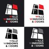
willz-logo.jpg

wilz-bcard-back-.jpg
 
From first glance, the picking out of the w, w and d in red is quite distracting. I would tone that down. I'm also unsure of the justification of the text. The actual graphic part of the design is good, I think, but the text is bugging me. I'd maybe make more of 'Wilz' and less of 'windows are doors', if that makes sense. It is good though, for someone just halfway through their first year of study you definitely show promise!
 
From first glance, the picking out of the w, w and d in red is quite distracting. I would tone that down. I'm also unsure of the justification of the text. The actual graphic part of the design is good, I think, but the text is bugging me. I'd maybe make more of 'Wilz' and less of 'windows are doors', if that makes sense. It is good though, for someone just halfway through their first year of study you definitely show promise!

Thanks man thats a big ego booster. I forgot to mention that he had the lettering like this on his van and wanted it the same so I had no control over the type
 
Back
Top