You are using an out of date browser. It may not display this or other websites correctly.
You should upgrade or use an alternative browser.
You should upgrade or use an alternative browser.
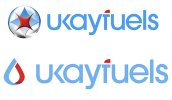
Which logo do you prefer
- Thread starter knightwebs
- Start date
Paul Murray
Ultimate Member
I'd have to say bottom simply because it's more of an actual 'logo' than the top one. It's quite similar to the British Gas logo though, both in concept and execution.
... It's quite similar to the British Gas logo though, both in concept and execution.
Very much so - and presumably we're talking about the same sector, right?
logovariations
New Member
I like concept #2, but I'm not sure if it will work in b&w and it seeks uniqueness.
