You are using an out of date browser. It may not display this or other websites correctly.
You should upgrade or use an alternative browser.
You should upgrade or use an alternative browser.
When logos look alike!
- Thread starter Stationery Direct
- Start date


facemediagroup
Member
thank God for yeslogo LOL.
jim
jim
Anglo Design
New Member
wow yeah some almost identical. not sure about these 2 though...they have the same word...but other than that they are not similar in any way.
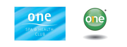
Yeah I think it was just the concept of using the number 1 as part of the letter n.
Pixels Ink
Member
"Tell yourself at every step in the design process that someone has undoubtedly already thought of this and what can you do to really set it apart. In design, and particularly logo design, the pessimistic axiom that “everything has already been done” is becoming more and more true, and it is only the virtuous designer who can continue to stand out in a sea of sameness.
Mike Davidson"
Wise words indeed.
Mike Davidson"
Wise words indeed.
dot design
Member
Very wise words, a great quote Col!
Pete
Member
Some really shocking similarities in a lot of those logos. Most of them I think I'll give the benefit of the doubt, the Blackburn Market, and Barrow logos for example are both pretty unoriginal (they've been selling these I<3 Blackburn T-shirts in the tourist info office for a few years now).
You've reminded me of this page on the Panic website Damon. They basically name and shame everyone who's ripped off their iconic Transit Van logo, it's classic.
You've reminded me of this page on the Panic website Damon. They basically name and shame everyone who's ripped off their iconic Transit Van logo, it's classic.
dot design
Member
Haha, I know! It's amazing how cheeky some people can be. If it's on the internet, people seem to see it as being public property.
That's very true Pete,
these people have no shame, how do they sleep at night?
GingerChris
Member
Horlicks
*longlonglong*
*longlonglong*
johnsonkyle25
New Member
Pretty funny! It’s pretty strange the one for Ubuntu, Human rights and free software, it’s like on the same page, just that the first applies to computers, and now they have similar logos!
IS-James
Member
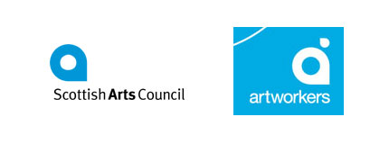
It is interesting that they have the Scottish Arts Council logo on there as a few years ago they had to slap down Quark for copying it as well.
Copy from article:
Quark's version:
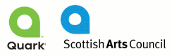
The details of the Quark debacle are detailed in this article at The Register.
Copy from article:
Quark's version:
The details of the Quark debacle are detailed in this article at The Register.