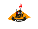
what's wrong with this logo ?

Boumez

New Member
Hi all am new here in this forum i just want some help from designers am just an amateur ,
the company which i work made a a logo competition for its workers so i made this logo and think its has something missing here any help (advice-edit-change) ? thank you
PS: the dune and the 'ourhoud ' fonts are mandatory but you can edit them
 

Attachments

  • logo.pdf
    212.2 KB · Views: 16
first issue - doesn't scale, look at the design at smaller sizes like a letterhead for example
second issue - no idea what it's for... is it beer or oil?
third issue - the 10 9 bit... is it supposed to be 109, 10 to the power of 9, 'ten nine'... or something else

And to be fair without context it's a bit hard to judge something completely

thanks sir for your feedback so its a special event the 1 billion oil barrel produced 10 to the power 9 , i guessed that the refinery and flare and dune on the background represent oil industry , about the first issue any suggsetion :/ ? thank you
 
take the yellow off and the banner unless these have been specified to be included?

instead of the banner type OurchHoud in the same red as the 109 and slant it like the lines underneath the main logo.

just see how it looks initially personally thats what i would try on my second pass if it was one of mine, the font of Ourchhoud is very difficult to read and honestly i am looking at the design drawn to it when i think the actual logo and event (so the 109 barrel etc) should be more prominent on glancing at the logo as opposed to the banner and text inside it.

if the yellow is required for there branding maybe try changing the lettering after 109 to that colour, however you will need to make sure to supply a white version like above for any B/W printing, could also try changing the slanted lines to yellow, again only if yellow is required for their branding.

Thank you sir for this helpful feedback i will add you some details the yellow and "dune" shape and "ourh oud" fonts are mondatory , i will try your helpfully advices :)
 
Back
Top