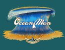
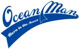
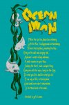
What do you think of this for a T shirt?

ocean man

New Member
Hi everyone, just starting up a few T shirt prints and wanted some feedback. As I'm into water sports and diving I wanted to create a high end laid back brand image based around these, and life in the sea in general. I like the Amphibious Outfitters designs but they are very SCUBA orientated.

These are just drafts, and there will be more features on the finished products.

Any comments welcome
 

Attachments

  • ocean man WAVE.jpg
    ocean man WAVE.jpg
    20 KB · Views: 42
  • ocean man wave4.jpg
    ocean man wave4.jpg
    90.9 KB · Views: 37
  • ocean man text-01.jpg
    ocean man text-01.jpg
    17 KB · Views: 45
I agree. The third one is 'the one' if you get me! -nudge nudge- I know they are just prototypes, but couldn't help but criticize the favoured one - the join to the 'N' from the 'A' needs to be less, seems to be too far away. Apart from that, a big thumbs up!
 
There's something quite nice about the 1st one for me. I like that sort of illustrated style.
 
The first one is my fav :) I think the second looks a bit dated already, its good but I have seen this sort of thing lots with surf stuff and the third is a bit too safe for me ... but hell do what you like lol!
 
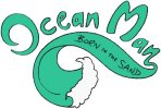
The first one is my fave too. I'd wear this on a t-shirt - it has a character. The last one lacks uniqueness in my opinion(also the first association I made when I saw it was A&F) and the second is a no-no for me - a bit of a slap in the face! :)
 
Last edited:
Hi guys, thanks for all the comments, sorry for my ignorance but whats A&F?. I'm was trained in product design so not great at illustration and graphics so its great to see what people think, I personally like the first one too as it looks more relaxed.

I don't think Ill ever get one that everyone likes though!
 
I think is a good idea what you do. particularly because from a marketing point of view, you have a clear niche that you can market to. as far as the designs are concerned, maybe adding a little more complexity would make them stand out a little more. ad a few 'quotes' maybe, a little text that reflects your brand image and speaks to your market, think of a representative logo to carry your image over social media platforms, a logo, a name and a slogan.
in any case, wish you good luck
 
Since my last post

I think is a good idea what you do. particularly because from a marketing point of view, you have a clear niche that you can market to. as far as the designs are concerned, maybe adding a little more complexity would make them stand out a little more. ad a few 'quotes' maybe, a little text that reflects your brand image and speaks to your market, think of a representative logo to carry your image over social media platforms, a logo, a name and a slogan.
in any case, wish you good luck


Hi Julian, thanks for the post, its nice to get someone elses opinion to see if all your work has been in vein. I have since had a sample of the wave made but needs more distressing, I went through several variations and picked one, still not sure if was the right one but we'll see. The slogan is 'Born in the Sand' which links to the sea turtle logo, again not sure how stylised to go with it. Going for a beach wear (billabong/fatface) look.

I had a look on your ebay listings, nice a simple but well thought out.

Good luck and keep up the good work

Shaun
Ocean Manocean man swirl options.jpgturtle logo options.jpgOde sketch no OL.jpg
 
Back
Top