Western themed bar

bryan1690

Member
Hi there,
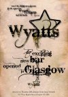
I thought i,d come and seek some advice from people in the know.I have a few questions regarding a piece i,m currently designing for a Typography brief in college.The theme is Western and the target audience is 25-40.A3 in size and an accompanying invitation.My question is does this font work and regarding placement and size of the chosen font , does it give it enough impact.I will look forward to hearing the feedback as i am in two minds whether i like it or not,thanks again.


Bryan:icon_wink:
 

Attachments

  • final artwork.jpg
    final artwork.jpg
    99.2 KB · Views: 52
I'm not massively keen on the font as it's difficult to read (especially the address). I think by all means have an element of the typeface you've used, but mix it up with a more legible font

BTW. There's also a mistake in the line 'you'd be doing me a favour...' (you need an apostrophe not a comma on the first word)

I think the weathered effect looks good on the poster but the sunbeam graphic doesn't have any relevance to anything Western.
 
Last edited:
I can't read much of the type in places. I agree the grungey feel does add a bit to the feel of the poster but legibility is the most important thing on a poster.

As mentioned, the sun burst has no relevance and doesn't really add much to the image. And I'd get rid of that lens flare effect on the tail of the Y in 'wyatts'. Paul Rand will be turning in his grave :p
 
I find the text on this really difficult to read and the lens fare is quite awful to be honest.
It looks like it's advertising a metal gig or a dirty rock club? Not a Western bar?
I don't think you need to be massively grungey about this to give it a Western feel at all.
If it's for college, what have you been looking at research wise? :)
 
I like the font - it works in Western terms without being an obvious choice. I don't really get the slogan (am I missing something?) and the sun graphic, although not inappropriate as an idea, looks decidedly eastern here (as in 'land of the rising sun') so, in that sense, it's about as inappropriate as you can get.

EDIT: Oh - and CAPS for the postcode.
 
that font is quite over used, i've seen it quite alot.

it's a bit hard to read, maybe go back to the drawing board on the font front
 
Wow.Well yes thank you for the feedback,i take everything on board and will do my best to fix all the issue with it.Having just had a crit today with my tutor she did raise the same issue,legibility of the font,sunbeam graphic,lens flare(which i now look at in disgust),etc etc etc.The slogan is a line from Billy the Kid,Wyatt Earp,hence the name Wyatts.As far as research goes i have looked at all things related to the particulaer genre,focusing more on the contemporary and latter modern side of Western genre,3:10 to yuma inspired me and took inspiration with the sunbeam graphic from the visuals used in the film.I will repost the latest version of this artwork,and will definetely not let the negative feedback get to me,as i said it was a first attemt at a typography piece ,never claimed to be a David Carson.Listen thanks again honestly all banter aside,hope to speak to you all again and hopefully on a more positive note.

Bryan
 
edited after crit

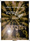
hi guys , edited version for another crit,feedback welcome
 

Attachments

  • wyatts.jpg
    wyatts.jpg
    98.3 KB · Views: 21
Hi Bryan,

Thanks for the updated jpeg.

I think you need to explore a few other fonts as the font you're currently using is still too distressed and as a result, it's not very legible.

You said in a previous post that your inspiration was the movie '3:10 to Yuma' - in that case, a more apt Western font would be something like this from Device Fonts (I'm guessing there will be lots of free alternatives to this on dafont.com).

At the minute, the poster doesn't grab my attention (possibly down to the lack of colour and lack of imagery). I think the question you need to ask yourself is if the text was converted to a foreign language, would you still be able to guess that it was advertising a new bar opening?

Lastly, the typeface at the bottom of the poster doesn't have any unity with the other font - it's far too delicate and just looks like an after thought.

Apologies for being quite harsh on your work as I know it's not what you want to hear…however, I think you have the essence of a good idea but it still needs pushing a lot more

Cheers

Scott
 
I think the Chase font would be a bit obvious (which may have its merits but not in terms of originality). I strongly dislike the star device in the logo as it's too intrusive and I think a quote should be in quotes. All in all, however, I think there was more to like about the first draft than the reworked version.
 
My two pence worth.

The Bleeding Cowboy font, everyone's seen it a million and one times, this doesn't make it a good font. Like I said earlier, this seems like a poster for metal night at a line dancing club. I just don't think it feels truly Western, it's always got that grungey/metal look to it. And really? Western and Metal combined, when did that ever work?

Your background has went from being over intrusive and sunburst(y) to being really dull, plain and boring, yet I realise that's quite a Western thing. Plain paper texture backgrounds and the like. You say you're taking influence from 3-10 to Yuma, so why not 'appropriate' the layout of their DVD cover, which I seem to remember being quite striking? Red text would probably work pretty well.

The layout also leaves quite a bit to be desired. This is a poster. You have 3-4 seconds to grab somebody as they walk passed. Does it really need Wyatt's on twice? The star, as previously mentioned, just doesn't work on that scale. Maybe reduced in size, and placed more strategically. Does it really need all the quotes and things on it? From this poster we need: The bar name (Wyatts), the opening times and dates etc. That bit that you've got in delicate little text at the bottom, besides the bar name, is probably the most important thing on the poster.

Also, is that Bevel and Emboss on the text I see somewhere? That doesn't work. It hasn't for years.

For me, Western springs this to mind 'capital letters. striking. in your face. regimented'. WYATTS should definitely all be capitals I think, I'd probably even consider type setting the whole poster in caps.


(again, sorry for being harsh but I think it's the basis of something, that needs pushing more).
 
Also, I recommend distressing the text yourself as opposed to using a distressed font. It's a quick and honestly, lazy way of adding texture and results in repetition through out.

Use a strong, clean typeface and add distress to it via alpha masking yourself.
 
Also, I recommend distressing the text yourself as opposed to using a distressed font. It's a quick and honestly, lazy way of adding texture and results in repetition through out.

Use a strong, clean typeface and add distress to it via alpha masking yourself.

I have to say, doing that has never ever crossed my mind.
 
Back
Top