Website Re-Design

pjohnstone

Member
Hi everyone.

First post on here so here goes!

We have recently re-designed the website division of our companies website. We went for a 'one page' design that uses Jquery to access different sections of the page.

Just wanting peoples thoughts on how clear the message is and if its easy to use/navigate etc.

Any feedback would be much appreciated.

www.streammedia.org

Thanks

Peter
 
My first comment would be that (just in my opinion mind), usually when you hover over a menu item like those in the top right, and get a drop down option, the drop down options are clickable, and yours (except the last one, oddly), aren't - they're there more so as a little bit of (basically pretty obvious) explanation. I don't think this is necessary and it is a little confusing at first as you don't know where to click.

No other gripes at the moment though i am just skiving in work so not really giving it a proper look ;)
 
Thanks for the feedback.

Now fixed. I understand what you mean with regards to the dropdown. Its there to make the menu stand out just that little bit more than just a basic hover.

Cheers!
 
Hi Peter.

You have a great site there! well done.
The Design is great, it's modern and well coloured.
I like the drop down menus too.
Looking good :)
 
Thanks I4Visual.

Our old site was very bogged down with too much information and users were telling us they were getting lost and did not understand what we actually did.

With this site we decided to keep things very simple and clear. Let the work do the talking.

I am glad you like it.
 
Hi Peter :icon_smile:

Overall, very nice!

A couple of points / questions:

  • Email address in top bar not clickable.
  • Happy Clients quote texts are a bit small on the font size and large on the leading for my liking.
  • Get a quote from us button could use a bit more margin underneath to even it out with the margin above the Why Us? and Happy Clients headings.
  • This Get a quote from us button is also chopped off on a 1024x768 resolution and is the only call to action in the first section - consider revising copy in preceding paragraph to allow it to fit on? OR reduce height of Happy Clients to allow the button to go above or below?
  • What We Do section is nice, but the line length is too long, spoiling the visual appeal and damaging scanability and legibility.
  • What We Do Slider doesn't loop - why?
  • Clicking on the Our Work slideshow (why is this different in style to the What We Do slider?) opens the page up again in a new window/tab... that's not right surely?
  • Get In Touch form - Using FireFox (latest version, 3.6.8) on a Mac, step 3 slips below and the drop down selection elements are outside of the dark background of div#getintouch so the supporting texts can't be seen. Seems fine in Safari though.
  • Blog - Text in the top orange bar isn't vertically centred as it is on the main page.
  • Blog - Line length of the entries is too long in my opinion, but not so important for the blog as someone has chosen to engage at this point.

Being really picky:

  • "Want a website? Give us a call" takes you to a contact form, not a phone number. Maybe "Want a website? Drop us an email" would be better?
  • A page should only have one <h1>. Some people think differently - but they're wrong :icon_tongue_smilie:
  • You have presentational class names, e.g. ".white-font"
  • Maybe add some more margin below your twitter feed? Seems a bit tight compared to the other columns.
  • Footer is inconsistent between blog and main site - Main site "Stream Media is part of Axis Media Group | Visit our blog" / Blog "Stream Media is part of Axis Media Group | Privacy Policy | Careers". A link to the main site in the blog footer and the privacy and career links on the main site would be nicer.

Hope you don't hate me and hope that's useful :icon_cheers:

/Doug
 
Doug you picky little thing you :eek:
No I totally agree with every point made, myself I was just commenting on the look/feel of the site
Very well spotted though Doug, I find myself making mental notes like yours, then forgetting to write them down :(
 
Cheers I4 - I do really like the site though! Don't get me wrong :icon_smile: Just trying to be helpful.

I also have a huge list of things to do to my own site(s), it's just whether or not I get around to implementing the changes before I want to redesign them completely :icon_wink:

Hopefully I've not offended Peter...

/Doug
 
Last edited:
No Doug fantastic feedback!

When you work on something like this you start to miss little things like you have pointed out. I am delighted you took the time to go through the site in so much detail.

I will update later today!
 
Hi Peter :icon_smile:

Overall, very nice!

A couple of points / questions:

  • Email address in top bar not clickable.

    Fixed!
  • Happy Clients quote texts are a bit small on the font size and large on the leading for my liking.

    Fixed!
  • Get a quote from us button could use a bit more margin underneath to even it out with the margin above the Why Us? and Happy Clients headings.

    Fixed!
  • This Get a quote from us button is also chopped off on a 1024x768 resolution and is the only call to action in the first section - consider revising copy in preceding paragraph to allow it to fit on? OR reduce height of Happy Clients to allow the button to go above or below?

    Will check this later. I have changed the copy slightly so hopefully that has sorted it out.
  • What We Do section is nice, but the line length is too long, spoiling the visual appeal and damaging scanability and legibility.

    I have kept the images the same size but brought the text in slightly with some padding.
  • What We Do Slider doesn't loop - why?

    Will have to have a look at the code on this and see if I can put it into a loop. As it makes the arrows redundent once you get to the end on either the left or right.
  • Clicking on the Our Work slideshow (why is this different in style to the What We Do slider?) opens the page up again in a new window/tab... that's not right surely?

    This has now been fixed. The links to site had not been put in! With regards to why its different. I wanted the 'What we do' to flow from one section to the next. While the 'Our work' section I wanted people to pick and choose - basically have a bit of fun selecting the different options. I think it works quite well this way as if it was the same as what we do they would hev to click 17 times to see the last website.
  • Get In Touch form - Using FireFox (latest version, 3.6.8) on a Mac, step 3 slips below and the drop down selection elements are outside of the dark background of div#getintouch so the supporting texts can't be seen. Seems fine in Safari though.

    Yes will have to have a look at this. Seems to be fine in all other browsers. I am also in the process of getting a mobile friendly version sorted out.
  • Blog - Text in the top orange bar isn't vertically centred as it is on the main page.

    Fixed!
  • Blog - Line length of the entries is too long in my opinion, but not so important for the blog as someone has chosen to engage at this point.

    Yes might look at reducing it as it is quite long and I understand will be hard to read on larger resolution monitors.

Being really picky:

  • "Want a website? Give us a call" takes you to a contact form, not a phone number. Maybe "Want a website? Drop us an email" would be better?

    Fixed!
  • A page should only have one <h1>. Some people think differently - but they're wrong :icon_tongue_smilie:

    Yeah something for the future!
  • You have presentational class names, e.g. ".white-font"

    Not sure what you mean by this, can you explain further? Ta!

  • Maybe add some more margin below your twitter feed? Seems a bit tight compared to the other columns.

    Fixed!
  • Footer is inconsistent between blog and main site - Main site "Stream Media is part of Axis Media Group | Visit our blog" / Blog "Stream Media is part of Axis Media Group | Privacy Policy | Careers". A link to the main site in the blog footer and the privacy and career links on the main site would be nicer.

    Now fixed!

Hope you don't hate me and hope that's useful :icon_cheers:

/Doug

Once again thanks so much for the in depth feedback!
 
No problem, good work :icon_wink:

Call to action is now visible without scrolling on 1024x768 :icon_thumbup:

I agree with your thoughts on the different slider / slideshow styles. Though I think for the What We Do looping and keeping the arrows would be good - personal preference though I guess. I like to be able to click through over and over, scanning the images. If it's obvious it's going back to the beginning, I think it's nice.

An additional thing - might be nice to put a hover effect on the 'Get a quote from us' and 'Get in touch with Stream Media' just to re-enforce that they do something if clicked. Currently the 'Get a quote from us' only has the change of cursor and the 'Get in touch with Stream Media' button has nothing.

Email address in top bar of blog still not clickable / linked.

The text on the blog now (may have before, but I didn't notice) seems to be cut off on the right side (see attached image)

Footer is still inconsistent, but only in that the blog doesn't have a link back to the main page, but that's up to you :icon_biggrin:

  • You have presentational class names, e.g. ".white-font"

Not sure what you mean by this, can you explain further? Ta!

Good, semantic HTML should have content marked up with semantic IDs and classes, describing the content's meaning and leaving the CSS to describe the content's style. .white-font is a presentational class name, describing it's style, whereas .introductory-text for example would be descriptive of it's purpose and meaning. As I said, just being picky. Makes no difference to how the site works, but if later in life you want that style to make things red, it would no longer make sense.

Oh, and I noticed you've got no meta data in your blog's head, in case you forgot... many WordPress plugins can sort that out for you though.

Oh, and to be reaaaallly picky again, going backwards and forwards in the browser, the logo and top bar wiggle between the blog and main page. Doesn't really mater though.

I'll shush now.

/Doug
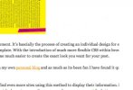
 

Attachments

  • Screen shot 2010-09-03 at 16.06.13.jpg
    Screen shot 2010-09-03 at 16.06.13.jpg
    16.7 KB · Views: 4
I realised I had to scroll right down just to see more features of the website. I would suggest for you to create like a few pages/tabs. You think it's possible? Do you host it yourself?
 
I realised I had to scroll right down just to see more features of the website. I would suggest for you to create like a few pages/tabs. You think it's possible? Do you host it yourself?

There are tabs at the top of the site that if you click on them take you to the other sections of the site.
 
Back
Top