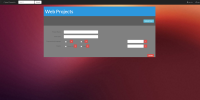
Try making the whole form container narrower so there's less space. Keep it all concise and the elements together. This will help UX too. I assume the inputs in the bottom right with the + symbols are for adding languages? If so, there's no clear correlation between the too. Bringing them closer will help, as will adding input labels (it sounds obvious but make everything as easy to understand as possible).