Ways to improve this logo design

Anglo Design

New Member
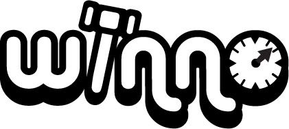
hi there, hope you are all well. i'm designing a live auction website logo. i want to display the auctioneers gavel plus the time limit in the logo, which i've incorporated into this first design idea. I'm going to be improving the design today but i'd love to hear what ideas you might have to improve the look and bring it together better, if you don't mind :icon_wink:

view logo idea here

:icon_notworthy:
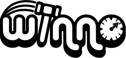
 
That's good that Anglo, I like the concept.

The thing I'd consider improving is the style of the hammer within the text. There could be improvements made to make it more rounded and blobby as the current text is. Obviously try a range of texts anyway.
 
That's good that Anglo, I like the concept.

The thing I'd consider improving is the style of the hammer within the text. There could be improvements made to make it more rounded and blobby as the current text is. Obviously try a range of texts anyway.

yes yes, good idea. cheers for that. :icon_wink:

my original designs were this and this but he didn't like them, and requested the gavel.
 
Last edited:
Hmmm

Hi, I don't think the drop shadow works - just design it flat and then look at the flourishes - IF they are necessary. (9 times out of 10 you won't need them if the logo is strong.)
The typeface is terrible and previous versions were better. I think the scale of the gavel should be smaller.
The green looks like a standard green off the palette and I'd suggest finding something less vivid.
It doesn't read terribly well due to the swapping between grey and green. Work on the words 'winno' and then see if the clock and gavel can be worked in. Perhaps an egg timer might be a nicer alternative?
 
Pcbranding, your experience and knowledge in this is really useful, glad to see you around the forums.
 
new design i'm working on, just in black n white at the moment,

winno4.jpg

winno4a.jpg
 
Last edited:
Personally I'm not a fan of that font, it's overused for a reasonably average font. I still like the concept, I think it could work but I don't really like it as it is.
 
Just an idea.

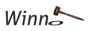
What about the o of winno as a sound block and a gavel coming down to hit it?
(I did do a quick draft of what I ment, but couldn't upload it :icon_rolleyes: )

Aha....done it (sort of...)
 

Attachments

  • winno.png
    winno.png
    12 KB · Views: 7
Back
Top