Urgent Help Needed!

Right, I have been doing a flyer for a local music festival and for the back of the flyer I have been asked to do a map that shows the accessibility from the surrounding areas.
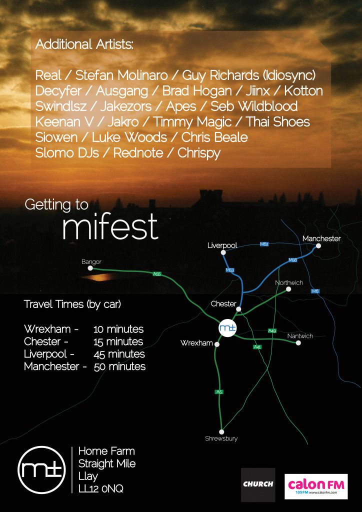
Below is a draft of what i have been doing but I can't do the map a way that I like it. I can't help but think it looks really amateur.

Please could people suggest anything I could do to improve, in particular, the map area of the flyer.

Thanks a lot!

mapdraft.jpg
 
I actually like it a lot. I think it's nice that it's been integrated into the flyer and not shoved in a box which it could easily have been. I know you've used traditional colour, but I wouldn't be afraid to experiment with other colours that maybe blend in a bit more seamlessly. I'd also look at the type size, I'd been concerned about readability, though you didn't mention how big the actual thing is so maybe it's okay.
 
I think it is going to be normal flyer size, around A6, so type size is a good point. And I have had a play with different colours but I thought by using road colours it makes it clearer and more informative for people looking at it.

And Dave, I did think about doing something more abstract but I think being literal with "the geographical approach" is more what the client wanted because he wants it to show how close the festival is to the surrounding cities/towns and so it makes it clearer that way.

I will try and play around though in accordance to your feedback and see what I can do.

More feedback muchhhh appreciated!
 
The reason i ask is, i seem to remember that poster design been quite dark and if the front of this flyer is a scaled down version on the same colour palette then i feel it may be a little dark for a summer music festival?
Any chance of viewing the collection?

Must have posted that just as i was posting this?
 
The front of the flyer is the one I posted in between your first two posts, the one with the grass. And the back will be the map.
I know what you are saying about the dark colours. But the client seems to like it. And if the front is already finalised, and I use a bright colour on the back do you not think it will take away from the front?
 
I actually like the way you've done the map, too. Maybe blend the picture at the top into the darker area better but, other than that, I do like the map.
 
... and I use a bright colour on the back do you not think it will take away from the front?

Irrelevant, I reckon: you won't see the front and the back at the same time. I ran my first car with wheel trims on the driver's side and none on the other and you'd never have noticed - same principle.
 
...And Dave, I did think about doing something more abstract but I think being literal with "the geographical approach" is more what the client wanted because he wants it to show how close the festival is to the surrounding cities/towns and so it makes it clearer that way.

In that case, it's fine as it is (although I think the journey times tell you more than the map on that front).
 
I too actually quite like the way the map is done, but the little gold flash underneath Bangor is distracting, I'd get rid of that :)
 
Also, perhaps if the roads that are left sort of hanging are faded out a little as opposed to just cut off quite abruptly?
 
I too actually quite like the way the map is done, but the little gold flash underneath Bangor is distracting, I'd get rid of that :)

Hi, this is a really nice poster and like everyone else said, the map looks great! So much better than if you had shoved it in as a normal old grey map! The only thing I would say, is as linziloop said above - the gold/orange under the word Bangor looks a little out of place! Other than that, it looks fab!
 
Back
Top