trashcendence
New Member

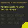
hi this is my first typedesign, a display font, legibility was not primary, more like consistency
any constructive feedback is appreciated.
Hi this


Yes I have done number, also thinking to do punctuationAre you going to do numbers, punctuation and diacritics?
H and X are too similar. D looks like an O. F could be mistaken for a P