Tony Hardy
Well-Known Member
Hi everyone,
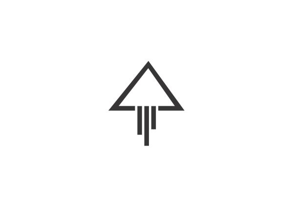
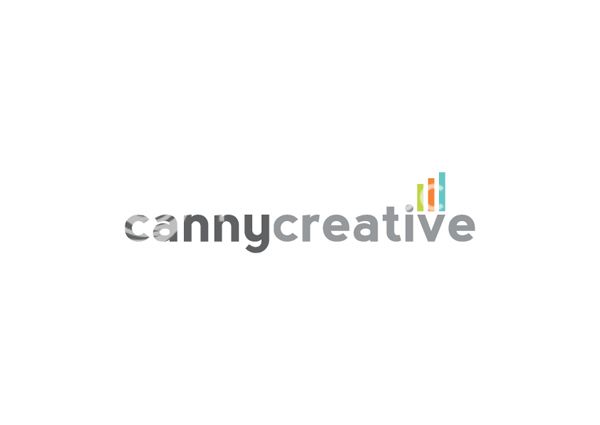
I've been working on a rebrand for myself/Canny Creative for the past few days, and I've got a logo that I'm 70-75% happy and positive with.
However, I'm having a real issue with the typography. Everything I've tried just hasn't worked. I'm also not impressed with the overall footprint of the icon.
Has anyone got any thoughts?

