You are using an out of date browser. It may not display this or other websites correctly.
You should upgrade or use an alternative browser.
You should upgrade or use an alternative browser.
Todd gig poster
- Thread starter Mattdbryce
- Start date


Thewholehogg
Active Member
Isn't Kilburn spelt with only one L? Not Killburn.
mrp2049
Senior Member
As a poster whore, its got all the details on it, which is important.
But doesn't do much else. If you look up some tutorials on screen print style, you can push a simple idea just that little bit further.
This is one of my recent jobs. Tiny little details that have given it a little extra edge, like texture and halftoned details...
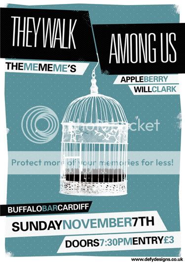
There is nothing wrong with what you have done, nothing at all, but that is what I would do to push it further.
But doesn't do much else. If you look up some tutorials on screen print style, you can push a simple idea just that little bit further.
This is one of my recent jobs. Tiny little details that have given it a little extra edge, like texture and halftoned details...
There is nothing wrong with what you have done, nothing at all, but that is what I would do to push it further.
Mattdbryce
Member
Great, Thanks mrp2049!
Very nice poster by the way, may i ask, is it all stock imagery and filters or do you use a tablet to draw?
Found this cool tutorial i'm going to look at, plus The Bronx are a great band, bonus!
Design a High Impact Gig Poster Suitable for Screen-Printing | Psdtuts+
Yeah thought there was something a bit plain with my poster, lets see if i can jazz it up!
Matt
mrp2049
Senior Member
It's a bit of everything, stock images, little bits of correcting by hand, depends on the job,
I don't use filters any more, I think the effect they give is absolute (insert swear word here)!
That is a good tutorial actually.
Emptees - Resources - Quick Tips: Halftones
Also a handy ready as it is about prepping for screen prints.
I don't use filters any more, I think the effect they give is absolute (insert swear word here)!
That is a good tutorial actually.
Emptees - Resources - Quick Tips: Halftones
Also a handy ready as it is about prepping for screen prints.
Mattdbryce
Member
davewill
Senior Member
Wow! that is a complete turn around from your first version. Sorry to be a drag, but I think now its gone too far the other way. The information is hard to read and too small so the main point of the poster is lost. As much as it is nice to use stylish images and effects dont forget the primary aim of the poster is to promote the event so that message should be easy to read and understand at a glance.
Tom Sound
Active Member
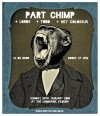
Mattdbryce said:So totally new design based on that tutorial.
Whaddaya think?
Matt
Todd rock hard, small world, I've known Chris :badumtsh: for years and Jay (Bass) was my lodger until last year

Mattdbryce
Member
Mattdbryce
Member
Small world indeed! Yes they do...although you may have seen i've demoted them from the original poster! Only because of the "part chimp" idea kinda dominated the poster.
You should send them my poster. I really want to get in to this poster design stuff, it's great fun!
Matt
You should send them my poster
. I really want to get in to this poster design stuff, it's great fun!Matt
davewill
Senior Member
thats better matt. when ive done posters for gigs in the past Ive been told who the headline band is so Id check to make sure Part Chimp are the major players for that night otherwise it wouldnt make sense to base the whole concept around them.
this is purely my opinion but I actually prefer the original poster. I understand you wanted to try something new and its obvious you have been heavily influenced by the tutorial above but for clarity and style I prefer the first version. I think posters need to be clear and concise, they only grab peoples attention for a matter of seconds so if there is too much going on then the message will get lost.
Like Berry said, design is about communication, not aesthetics.Its crucial that your message is first and foremost in your design.
Mattdbryce
Member
Thank Dave!
Todd were in fact the headliners, however i decided to cheat a bit as the gig has been and gone and this is just purely to bump up my portfolio, which as you can see needs more design work - Matthew Bryce - Graphic Design, Photography and Digital Imaging.
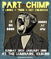
Learnt some nice tricks and shortcuts from doing the tutorial, but yes i agree, i prefer the original design, i have this poster on my wall at home - PART CHIMP | Flickr - Photo Sharing! and was trying to think bold colours, big graphics etc.
I just bought this book by Jason Munn for an xmas present and i'm seriously tempted to keep it:
The Small Stakes: Music Posters: Amazon.co.uk: Jason Munn: Books
He has some truely great poster designs in there.
Thanks for the feedback!
Matt
Todd were in fact the headliners, however i decided to cheat a bit as the gig has been and gone and this is just purely to bump up my portfolio, which as you can see needs more design work - Matthew Bryce - Graphic Design, Photography and Digital Imaging.
Learnt some nice tricks and shortcuts from doing the tutorial, but yes i agree, i prefer the original design, i have this poster on my wall at home - PART CHIMP | Flickr - Photo Sharing! and was trying to think bold colours, big graphics etc.
I just bought this book by Jason Munn for an xmas present and i'm seriously tempted to keep it:
The Small Stakes: Music Posters: Amazon.co.uk: Jason Munn: Books
He has some truely great poster designs in there.
Thanks for the feedback!
Matt