Tips for my GUIs

Rond

Junior Member
So, I didn't find any rule I breaking posting this so, here it goes, anyway, seems like nobody cares about the design of the guis in the game dev forums (or my guis are really poor at all), so I needed to appeal to specific design forums, I don't know if this is the perfect forum to post but it was the best one I found it... Let me know what you all think about the guis below:

Dialog box
walking_mode_dialogues_by_pokemonproject-d4rwe33.png


Ordinary cinematic layout
walking_mode_cinematic_by_pokemonproject-d4rwe0p.png


Quick items wheel
dae0b101a2489e53256ca5ddf171e7b3-d4rwdu4.png


Pokémons sidebar
b016a92d5dc556c56d93c68e754b4cbd-d4rwdh3.png


Bag screen
484acc1721a6b7661d85f10944f4f660-d4rgv3h.png


Pokémon party screen
3084f7300337d84cb4da193103bcf2ec-d4rf1st.jpg


Battle layout
battle_scheme_layout_by_pokemonproject-d4op22y.jpg


Ordinary 'ESC' menu
pause_menu_and_time_layout_by_pokemonproject-d4onqia.jpg


Oh, forget to mention, I'm working for Nintendo and I'm making this guis for them... Nah, just kidding, actually it's a fangame we are making...
 
I think I like the quick menu and the bag screen the most. The other menus feel a little cold and clinical by comparison, but they're nice and clear and easy to understand. The font doesn't exactly scream "Nintendo" but that might be why I like it so much, what is the font?
 
Ah Pokemon, takes me back to the days of chasing a kid around the playground who got the first Alakazam in school to trade, those were the days. Really like the designs, but here's a few things I personally would change:

1) The item wheel isn't exactly quick as it looks as though you have to open it first then select (correct me if i'm wrong). It would work much better as a fixed item located in the bottom right corner so that items can be selected at all times and without being in the way what's on screen.

2) You seem to have a few colour schemes going on there, might be an idea to try and keep to one, just keeps consistency throughout out the design.

3) The party screen needs some work. With something like that I'd be tempted to go for a full screen layout, have all characters aligned horizontally with details displayed below each image so you have everything on screen. If this is for a small screen display then you can still make it so you can scroll along to view more players.

4) The first sidebar design and battle layout design shouldn't really differ, the battle design is much more modern so would be could to keep this throughout. One thing I notice is the HP doesn't display very well.

5) The bottom bar in the battle layout could look better with using the colour scheme chosen from either the bag or party screen, personally I think the bag colour scheme would work throughout.

6) Why is the option menu in the corner? Naturally an option menu appears in the middle so it does look very odd in the corner
 
I thought the font looked familiar. Haha, no wonder I like it then, I'm loving Gill Sans at the moment.

All good points Ben. It's not just the colour scheme that changes though. The quick menu and bag screen are very rounded and soft, and everything else is sharp and angular etc. Some more consistency needed there too I think.
 
Good point Jim and also my dear friends you are wrong on the font, it's all about the "a", that there font is Futura I'll have you know.... **curls his mustache** mwahaha

But yes Gill sans is rather nice, just not as nice as Futura! :p
 
Wow, thanks for the replies guys!
Ok, jim, could you describe what can I change man, i just don't what to do about it... by the way, the font is Futura ! hehe
BenJonesDesign,
- so, to use the quick items wheel you just need the middle mouse button, point to to the item, and release the mouse button, the quick items wheel will not be visible all the times, it will pop up only when the player hold the middle mouse button, then it will hide automatically and the player release the button.
- First, i decided to use just one, but then i thought: Will not use a color scheme for each menu corresponding to it color on the game, like the pokedex is red, so the window will be red, bag its yellow, and so on, but it's true, it's a bit inconsistent, so, i will keep just one like you said, maybe i allow the player to change the general skin color.
- This is a great idea man, i drawed many sketches on paper, i think i filled a trash can but i never thought about it, i just don't know if it will fit and i will need to put a scroll bar, i will do this anyway. thanks, great idea!
- Its because the sidebar can't take player's attention, it's just for a quick check, it will be openable holding or pressing tab button (the player can setup to toggle or not), so i dont know what to do because i cant put the large hp bar on the side bar, it will take so much space and its very detailed, imagine have 6 of it always on the screen while just what you want to do is to know how much hp your poke have or how much xp you need to gain level, i dont know man... what you want to mean with don't display very well? the bars, numbers? teeeell mee, please.
- aaw man, just because i liked that style, but, you're right, i can't keep using different styles everywhere...
- So, this is the esc menu, the esc it's on the left side of the keyboard (you don't say?), there is a menu a bit like this, but it's the 'enter' menu (start on the gb, the menu items are pokedex, pokemon, bag and etc...) and it open on the right side... I don't know if I keep it this way or not, don't know if it makes sense, but...

I'm very confused, I think I'll choose a style and apply to all the windows, but It's hard because the item wheel style wouldn't look good on the pokemon and bag window, and vice versa...

ps: thank God i found this topic, many good hints, i was almost exporting the .pngs to build the menus on the game engine!

Oh, almost forgot, i made this yesterday:
42cj1k1n.jpg

just disregard, the male and female options, the player will select the gender on the main menu (don't worry about: "what? on the main menu?? man this is not a good idea!". I have a good idea for it.).

sorry for the bad english.

edit: as you all know, my english is very bad, and yesterday i just installed windows 8 and used the xbox live thing, i saw that the best is to use headwear instead of hats, so disregard that tooltip too...
 
all good stuff, glad we could help. With that customization screen I would increase the opacity of the unseleted items but other than that it looks good. One thing also, why are you designing it for the PC? why not the iPad as that is a more popular choice these days
 
BenJonesDesign said:
all good stuff, glad we could help. With that customization screen I would increase the opacity of the unseleted items but other than that it looks good. One thing also, why are you designing it for the PC? why not the iPad as that is a more popular choice these days

I'm making it using the unity engine, so after ill be able to build to it too, but ill need to rework on everything on the game (i'm using 1024x640 with no option to full monitor resolution, a bit strange resolution but i thought it could be better for those who still have 15" monitor and want to play in ws, dont know if im doing right), since the tablets resolution it's a bit different (don't know exactly), anyway, it'll be hard to put it on the app store because pokemon is high protected by laws and copyright, but it deserves a try... about the opacity i'll increase it.
 
well in any form publishing it would be illegal but in terms of a project keeping with modern technology is far more impressive that designing for old monitors on windows.
 
Hehe, around 98/99 when there was age of empires, and i couldnt play, my monitor was vga, and age of empire was minimum 800x600, imagine a sad kid... haha, so i dont want this to anyone, i will make something that everybody can play. :D
well in any form publishing it would be illegal
Yes, but publish to play directly from the browser or even standalone wouldn't have any problem (unless nintendo send us a cease and desist, what is very possible), the app store have so many terms and rules, i don't think they would let i publish the game there, and it's free. On the other hand, on the browser, i just need to build and host somewhere.
 
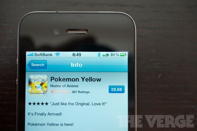
It'd be a wast of time even considering the App Store. Or making money for that matter, lol. Although the App Store did let an app called Pokemon Yellow slip through a while back, it was a scam.
DSC02361_large_verge_medium_landscape.jpg


How people didn't realise that Nintendo would never license it's first party software for use on anything but Nintendo hardware is beyond me.

Rond, I like the rounded edges in the Bag menu. Personally I think colour-coding the screens to their item of origin is a good idea, after all Nintendo do, as long as there is some kind of similar design elements flowing through them all).

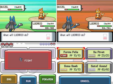
Definitely some colour inspiration to be had here...
pokemon_image_1173399814_1177116764.jpg
 
Wuut? But how? It's just question of time (is this right?) for Nintendo take this out of the app store.
Anyway, I bet this is just an emulator with a rom preloaded, who would pay for something you can have for free?
So, I think the rounded edges can't be used in all the layouts, like on the Pokémon Party screen, the Pokémon avatars it's square, so it would overlay the edges... I will colour-coding then. I don't like Pokémon diamond/pearl engine, I prefer the black & white, but it's nice too! I'll modify the screens and post here for you guys to see.

Until next time..
 
Back
Top