Thoughts on these concepts?

Paul Murray

Ultimate Member
What are people's opinions on these two logo concepts? The company's named Kaiser (German for 'emperor') and is related to BMX, so I've attempted a crown created from a tyre pattern.

Personally I prefer the one without the diamond above it (it feels 'bolted on') but I've been told to make it more 'crown-like'.

 

Attachments

  • kaiser1.jpg
    kaiser1.jpg
    33.9 KB · Views: 26
  • kaiser2.jpg
    kaiser2.jpg
    27.6 KB · Views: 27
As a crown device, it's quite a smart idea but I'm not convinced it's quite right here. Try narrowing/squeezing it a bit maybe? More than that, though, I find myself imagining that there's meaning in it that actually isn't there, if you know what I mean.
 
Really like the idea Paul, but like Dave said, something isn't sitting right. Don't know whether it's the space in between the black shapes. Perhaps if they want it more 'crowny', the black marks need a little more detail? Obviously you don't want too much detail, that'd just be overkill, but perhaps some gem shapes? I realise there isn't loads of detail in tyre marks but there is room for movement.
 
Cheers for the feedback. I think they shapes do need to be smaller/closer, perhaps to help tie the type in with it?

More than that, though, I find myself imagining that there's meaning in it that actually isn't there, if you know what I mean.

I don't know what you mean I'm afraid mate :icon_wink:
 
Not sure myself reading it back but I think it's the clarity of the concept that's the issue. The ideas are all independently quite nice and the idea of amalgamating them is a good one but it's not really crowny enough, not really tyre tracky enough and consequently not hanging together well enough. I'd certainly continue down the conceptual path you've set off down as I'm sure there's a very smart solution at the end of it but the point at which everything comes together is still a bit of a way off.
 
I think I get what you mean now. To me, it looks like a crown/tyre track because I know that's what it's supposed to be, but people I've asked only pick up on one concept, if they pick up on one at all.
 
I'm liking the concept but have to agree with the others. I wouldn't particularly think crown or tyre unless you explained.

You'll get it though, no doubt
 
The concept is awesome. I know that 'you should work in black and white first' but maybe when you include colour (if you do) then one of the colours could suggest a more 'regal' affair? Rich purples, royal blues?
 
I'd stick with monochrome and perhaps look at creating something that incorporates the crown device in an untidy/muddy tyre track: think that could add a dynamism in keeping with the active bike thing.
 
Nice concept. Really nice concept.

Mono gives options for future colour variants for campaigns etc. I really like it.

The version on the left for me.
 
The one on the right looks more immediately like a crown to me. The whole concept is really clever. Wish I was that creative with a blank piece of paper in front of me.
 
Love the concept! (That photography logo's def paid off!) I agree with the others though, if you hadn't said about the bike I wouldn't be too sure what it was...either geometric or crown would come to mind, but not bike (for me anyway). Also I think the image looks a bit too big for the text. Dont have any recommendations though lol! As usual!
 
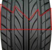
This is a car tyre not a bike tyre but it could maybe translate somehow or might spark of somesort of idea. Untitled-2.jpg

You could manage to also hint at mountains/ramps...which is predictable but ...
 
Thanks everyone for the input. The crown is the important element since that's what was requested, but I thought I'd be clever and tie it into bikes somehow, since I think it's really obvious and uninspiring to just do a crown above the type.

I'm gonna try and rework the idea but if it doesn't work I'll have to try something else.
 
Don't be put off mate. It is a very good concept, just needs some work to really bring the tyre tread through the crown more :icon_thumbup:
 
Back
Top