Paul Murray
Ultimate Member

https://www.designweek.co.uk/issues/11-17-july-2016/mastercard-new-logo-first-time-20-years/
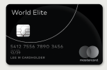
Thoughts? Seems to be a mixed bag of reactions from what I've been reading in comments. Personally I like the branding as a whole, though the logo I'm not really a fan of. The overlapping translucent circles feels a little bit trendy, but if you look at the logo from 1968 it's the same visual device so at least there's some justification for it.
One thing I did notice is how well the Visa logo stands out in this image. It's the first thing I noticed.

Last edited:

