Hi, everyone!
New user and novice graphic designer here in an intro typography class.
Our assignment for this class is to create a hypothetical event poster. The copy is mostly a timeline of events. The other requirement a headline reading “The history of type” alongside fake venue dates. We are also required to only use type, no illustrations or photographs. We’re not allowed to use more than one other color besides b&w.
I’ve been really inspired by Michael Bierut’s posters for the Yale School of Architecture.
I made 5 versions and I'm looking to print the three best.
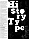
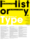
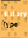
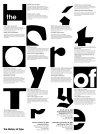
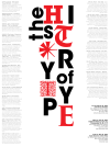
I just want to know if there are any glaring issues or anything I should work on for future projects.
I’m really grateful for any feedback!
New user and novice graphic designer here in an intro typography class.
Our assignment for this class is to create a hypothetical event poster. The copy is mostly a timeline of events. The other requirement a headline reading “The history of type” alongside fake venue dates. We are also required to only use type, no illustrations or photographs. We’re not allowed to use more than one other color besides b&w.
I’ve been really inspired by Michael Bierut’s posters for the Yale School of Architecture.
I made 5 versions and I'm looking to print the three best.


I just want to know if there are any glaring issues or anything I should work on for future projects.
I’m really grateful for any feedback!