Teen Helpline Logo Feedback

Gary Neville

New Member
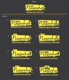
Hi Guys, been working on a logo for the past few days for a Youth Helpline. My clients likes it but they want some variations on the design and i've been drawing a blank, I think it needs some fresh perspective.

Would be greatly appreciated if you guys could have a look and give your feedback and ideas.

Please be as brutal (or as nice) as you want.

Regards
Gary
Logo_Reversed2-01.jpg
 
Last edited:
1,2,3,4 are much of a muchness

5 & 6 I don't like

7=3

8 I don't like


Try some different designs maybe? Not variations on designs...
 
Hey Hank, thanks for the feedback. The client is set on this design I gave them 4 Different designs and this is the concept they want to go with as it fits their brand.

Plus it needs to be done by monday :-(

Cheers
Gary
 
One thing that hasn't changed on either of these variations is the font. It's actually the first thing I noticed as it's not the easiest font to read. Maybe try the same theme (yellow box) but with a few different fonts?
 
The one that jumped out to me first and stuck was no. 2. All the others seem a bit too fussy. Having the phone and the number within the box just seems to remove all the complications.

I don't have any problem with the font; I quite like it. But if you are stuck with the same sort of design without much room for variation, font would be the first port of call to find a new look for the design. In this case, I'd definitely come up with different ways the font could be used, but keeping the same shape.
 
I think what Gary has said is that he has given his client different designs as options and they have chosen this one. They now want to see different variations of this particular design concept, not more design idea options. He has already given them 4 different designs and they have chosen this one. He has now even us 8 variations of the chosen design to choose from.

I personally would not go for any of them. I don't really like them to be honest. I think more creativity could of been put into the phone handle and speech bubble. I don't particularly like the fonts and I really don't like that tone of yellow but that might be because of the background colour.

I do like the design concept/idea, I just don't think it's been executed quite as well as it could be.
 
Back
Top