Tasty Treats - Business Card/Corporate ID

Tony Hardy

Well-Known Member
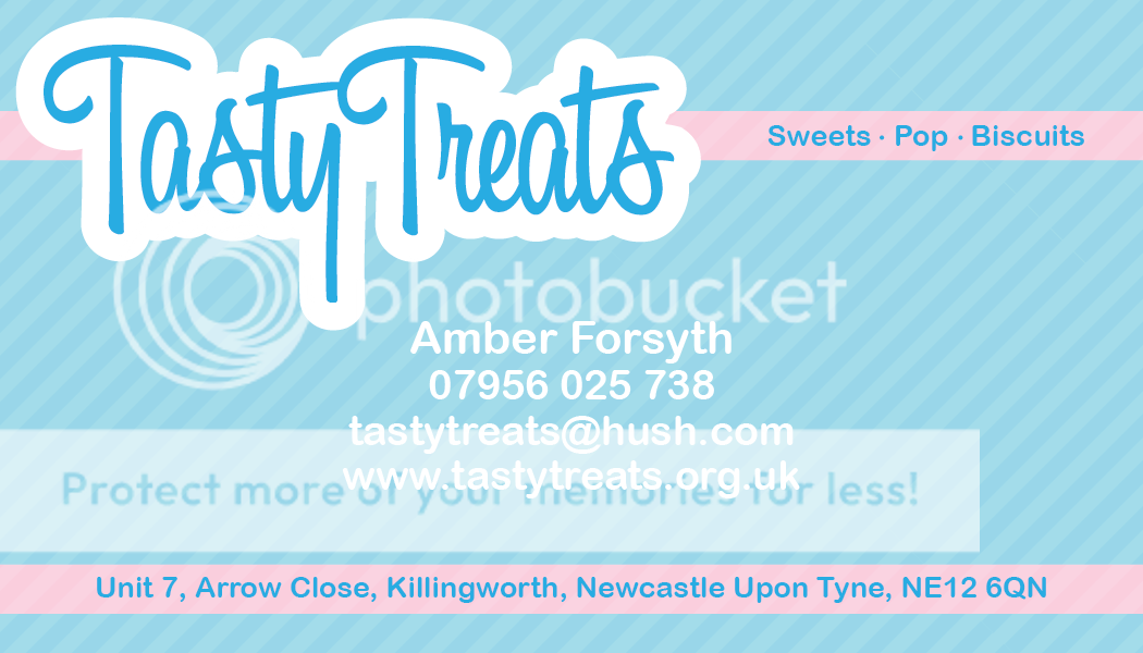
I'm busy working on a corporate identity/livery idea for one of my family members who's starting a sweet shop and runs sweet parties etc and I was hoping to get your thoughts on what I have so far, which is in business card form.

0001_tastytreats_businesscard.png
 
I don't mind it, I mean it does the job but in my mind's eye I was sort of expecting to see something more elegant, perhaps more a subtle background pattern rather than a block of blue. But that's just me.

It's perfectly fine, I guess I would have come at it from a different approach hence my comments above.

We is all different after all :icon_cheers:
 
The layout is clean and succinct which I like and the Tasty Treats typographical approach fits perfectly and is amusingly kitsch. The body text is a bit dull, but is perfectly legible and balances well with the exuberance of the headline font. I dislike the font that's in the magenta strips -but that's just my opinion.

I'm a sucker for 100% magenta and cyan, but I'm not sure if it's working here for me as I perceive it as representing something a little clinical or mechanical. Maybe a red/white/yellow mix or something more recognisably sweet-shop and less print-shop. I think it would also benefit greatly from a graphic/photographic element if you have the time, something that represents the product somehow.

It is coming along nicely though - well done.
 
One of things I should have explained here perhaps is her key marketing ideas were, cheap and fast. So I thought, flashy blues and cyans would have a nice kind of 'bubblegum' esque effect.

@49thfloor - I share your concers about the font in the pink strips, and I agree, Helvetica is a dull font, but, it does balance well in relation to the other elements on the page.
 
For me it's not a question of a cleaner round font, I personally don't think it looks sharp / smart enough. I just pasted the image into Illy and played fonts; to me even Myriad Pro sits better ... but just my opinion :icon_notworthy:

Overall though liking the stripey background and baby pink look much better :icon_thumbup:
 
Last edited:
Cheers :) I think it's working quite well now. Gonna leave it at that and crack on with the rest of the stuff.
 
Back
Top