Typografia
New Member
Hi alltogether,
after I really worked a long time on the idea of the "brushcatsle" as for my logotype, I dropped that idea completely.
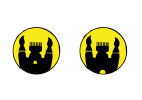
I did like the colour, the brightness, the contrast and the brilliance so much, the the brushes were alway seen als candles....
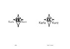
So went a new way, by just using abstract geometrical elements and typography:
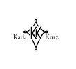
What do you think?
Would be a non-serif typography better?

after I really worked a long time on the idea of the "brushcatsle" as for my logotype, I dropped that idea completely.

I did like the colour, the brightness, the contrast and the brilliance so much, the the brushes were alway seen als candles....
So went a new way, by just using abstract geometrical elements and typography:

What do you think?
Would be a non-serif typography better?
