Jedd’s comment is:
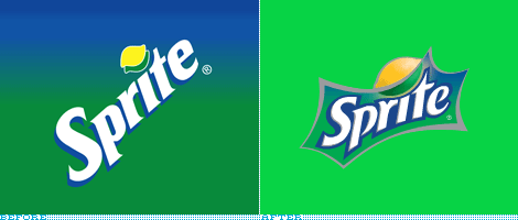
I don't like it. Ugly gradients and the type looks squished. Looks unfinished
On Jan.30.2009 at 07:08 AM
Brandon Cox’s comment is:
I think it looks appropriate for soda, but I also think it's okay to break with the soda tradition. I give it 3 years.
On Jan.30.2009 at 07:12 AM
Flipyap’s comment is:
When I saw this pop up in my RSS reader, my first thought was: "That's disgusting."
Not a great first impression.
Now that I had a chance to take a closer look at it (and ignore the terrible, awful "explosion"), I quite like the lettering and the way it cradles the lemon, though I think it looks more like a sports team logo, than of a soda.
On Jan.30.2009 at 07:22 AM
ArleyM’s comment is:
Looks stretched. The original is preferable.
On Jan.30.2009 at 07:31 AM
Barclay D.’s comment is:
eh. i would totally be fine with the 'starburst' out of the picture. i guess they are trying to keep to their... i guess tradmark you could all it with the gradient of blue to green. sure beats Pepsi's Sierra Mist newest.

