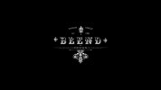
looks good but not sure is blend the name or the bit above it? just think of the heighrachy if it isn't the name as that what you have biggest.
Also a lot going on for a design logo in my opinion looks more like it would be better suited for a product like a drink. Just my opinion though
I don't think it will translate well to a smaller size. You won't be able to make out 'of' for example, or all the other little details in the flourishes. I'd recommend you try and simplify it a bit.
I agree with SDAVE I don't think the text "Blend" does really suit the other font. With what Paul said I would again have to agree, with some of the fonts being a small size if it was a smaller image you wouldn't be able to make it out and therefore would make the image pointless. Hope this helps!
This site uses cookies to help personalise content, tailor your experience and to keep you logged in if you register.
By continuing to use this site, you are consenting to our use of cookies.


")