You are using an out of date browser. It may not display this or other websites correctly.
You should upgrade or use an alternative browser.
You should upgrade or use an alternative browser.
Seeking feedback.
- Thread starter KatiaRum111
- Start date


Paul Murray
Ultimate Member
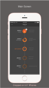
It's quite nice I guess. The only critique I can give at this stage is to perhaps show a little bit of lesson 6 at the bottom, just to make clear to a user that there is content off screen they can access. Check out this article on the illusion of completeness.
Aeon_Knight
New Member
I think the colors look good as they are and that it can actually be a plus that they're not attention grabbing. If the user has gotten to the point where they're actually doing a lesson, then you've already grabbed their attention! They downloaded the app, right? So now they need a learning space. Somewhere they can concentrate on what they have to learn and not get distracted by the background.
I don't know who your target audience is but if it's an adult market then my feedback applies. If it's kids then things get a bit complicated. On one hand, they have a short attention span so you need to find ways to hold their attention. A clean interface like that wouldn't work. You need something more dynamic, maybe some animations on those notes, for example. Bright colors as well (just not everywhere, lol). On the other hand....they have a short attention span so they're going to get more easily distracted. Find a balance.
Hope this helps.
P.S.: +1 to Paul Murray's comment. On point!