Right, I've just got home, seriously long day out!
So here we go with an explanation, 3 routes, I'll go from simple to hard with varying effects.
1. The eraser. Find yourself some brushes
misprinted type 4.0_art, design and type (1998-2009) Eduardo Recife has a few good ones, or just google texture brushes, and set the opacity of the eraser to about 30% and get erasing. This is a bit hit or miss as you might hit the mark, or you might spend ages trying to erase parts and still not find the mark.
edges on this were done this way. its good providing you chip away at it rather than trying to just erase a massive section at once.
2. The overlay. This is again another route that depends on your background. First things first, get some texture images, google it, macro on your camera and take some photos of the floor, walls, etc or scan things. Add a new layer, place the texture in there and resize it to suit, above the text layer, and change the layer settings to overlay, mess with the opacity, i usually go with 30%ish, repeat it 3 or 4 times till you get a setting you like.
You will find a few different problems with this, first of it depends on what colour you want the text, second, it depends on the background colour. I you are having problems with the text colour, desaturate the texture layer (apple+shift+u) and it will eventually balance out. If the texture is effecting the background, then magic wand/select layer/mask the text (personal preference, its up to you) so the texture only covers the text.
background on here is done this way.
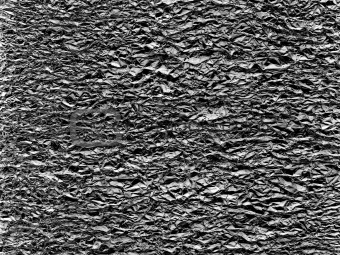
3. Using textures to erase. Right open any of your textures, unlock the layer, desaturate the image, play with your levels or contrast brightness or both, bit hard to explain the exact specifics as I don't know what textures you have, but your aim is to get it as black and white as possible with alot less grey.
take this as an example, it needs the levels ramped up to make the grey more white. Now once you have a more black and white texture, use the colour selection tool, once again play with the fuzziness to get more or less detail depending on what you want, select the black or the white, either is good, but I favour selecting the black, and then selection inversing and deleting everything else.
All you should be left with is the black detail, now take the black detail into your text file and use the magic wand/select layer to highlight the black detail and then select the text layer, make sure it is also unlocked and then deleted the selected area from the text.
texture detail on the text was done this way.
Does that make sense? Whilst I use textures the are generally of the floor, you can get this sort of thing...
by googling screen print texture.
If it doesn't I guess I could write my first tutorial!


")