You are using an out of date browser. It may not display this or other websites correctly.
You should upgrade or use an alternative browser.
You should upgrade or use an alternative browser.
Scotty's New Website
- Thread starter scotty
- Start date
GilmoreVisuals
Active Member
Love it. "He found early inspiration from vintage advertising mascots and surf and skateboarding graphics and combined his love for both design and illustration which gave birth to “Desillustrationâ€. A term he made up using his own head."
I think the home page smashes it. Especially for illustration emphasis (or Desillustration, as you would say) - maybe some work needs to be done on some of the other pages in terms of text layout / contact form, if you see what I mean.
I think the home page smashes it. Especially for illustration emphasis (or Desillustration, as you would say) - maybe some work needs to be done on some of the other pages in terms of text layout / contact form, if you see what I mean.
S
Sean Lee-Amies
Guest
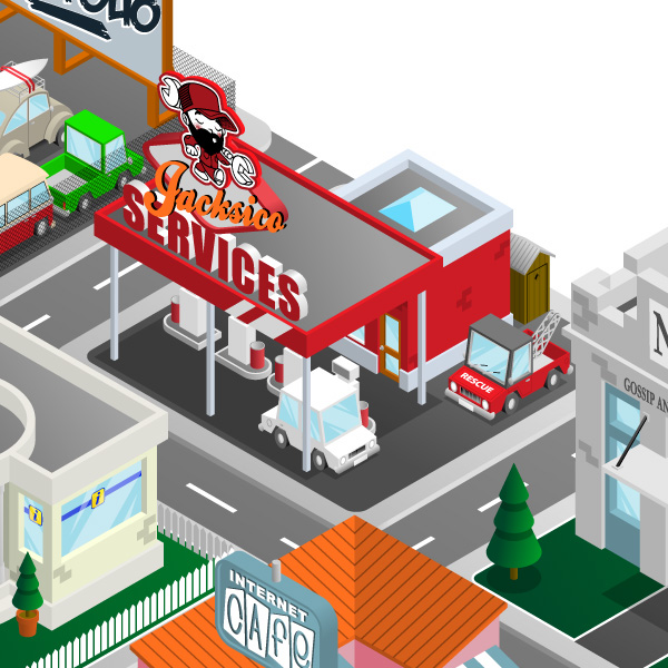
Excellent work Scotty and Jim! Scotty, I wouldn't want to be the one who has to park in that petrol station..!
Soprano
Member
I think that's what the rescue truck is for!Sean Lee-Amies said:Excellent work Scotty and Jim! Scotty, I wouldn't want to be the one who has to park in that petrol station..!
Really like your site Scotty, good work :thumbup1:
T
Tony Hardy
Guest
I split this out from the other topic as it's definitely worth a thread on it's own.
Love the new site Scotty. Did you code it all up yourself too?
Love the new site Scotty. Did you code it all up yourself too?
S
Sean Lee-Amies
Guest
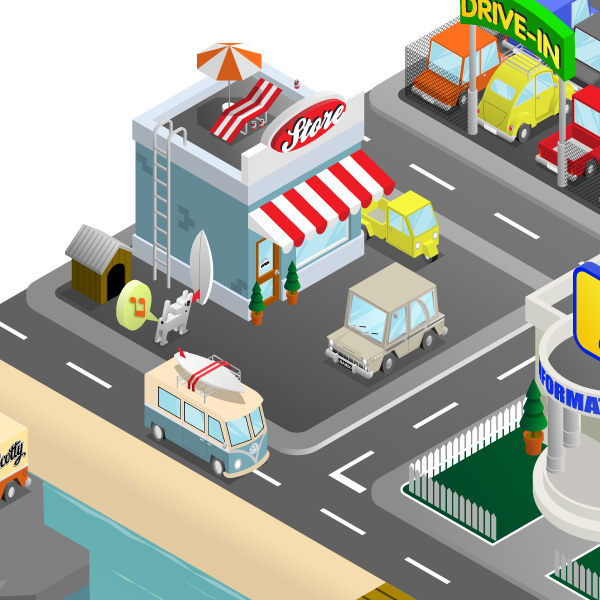
I agree, I also think that the "Jacsico" text is quite hard to read too. Also, the pavement under the news building needs fixing, on the right edge it looks flat, on the same level as the road! It's nice when you can only pick out such minor things with a design 
Jimlad
Well-Known Member
Just quoting my previous post here, since it never made the trip across.
So, yes. Appreciation officially restated for posterity. Or something.
Then there was the whole Monkey v Technology thing, but I shan't bother repeating it.I need a new way to say "Nice work, Scotty" because it's getting repetitive.
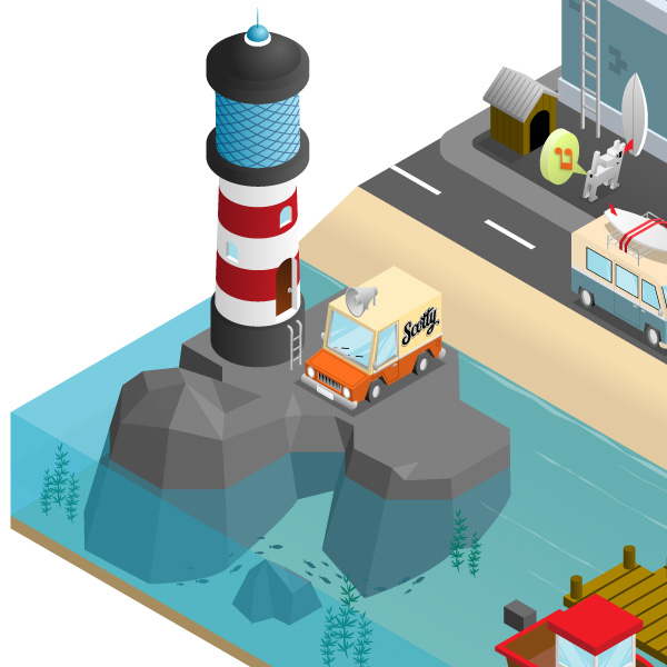
The characters are really cool, fun and punchy. The isometric website is a stunning visual treat, although I was slightly disappointed when I realised the water pipe coming out the side wasn't actually a button for pressing... but that's just my click-first-think-later nature kicking in.
So, yes. Appreciation officially restated for posterity. Or something.
Levi
Ultimate Member
Not going to judge the graphics side of things as we all know you're pretty poor at that side of things 
Only real issues I have are below but they're more of things I'd fix than needs fixing if you get what I mean:
background being fixed, it would move with the island - this is just me being picky because I used to do a lot of isograph images before the pc came about lol
the lighthouse and dock not doing anything, I want to click it like the rest of the 'island'
the jacksico logo (maybe lose it and just have services)
the information 'i' logo, it just seems too big compared with the other logo's
couple of the 'building' links don't cover the entire plot
wac
Senior Member
I'm really glad you shared this. I think it's refreshingly original and it's great to see this kind of stuff being without the use of Flash now.
The only trouble is that the home page is so good, it makes the other pages look a bit rubbish, even though in there own right they're not.
You need a favicon on it and also if you click one of the building you get a square appear round it. maybe...
:focus {
outline: 0;
}
would do it.
The only trouble is that the home page is so good, it makes the other pages look a bit rubbish, even though in there own right they're not.
You need a favicon on it and also if you click one of the building you get a square appear round it. maybe...
:focus {
outline: 0;
}
would do it.
SeedySteve
Member
Incredible!
JeffAtHuemor
Member
I'm going to agree with the first part of this, and then disagree with the rest of your sentence.wac said:I'm really glad you shared this. I think it's refreshingly original and it's great to see this kind of stuff being without the use of Flash now.
The only trouble is that the home page is so good, it makes the other pages look a bit rubbish, even though in there own right they're not.
You need a favicon on it and also if you click one of the building you get a square appear round it. maybe...
:focus {
outline: 0;
}
would do it.
Your home page is great (however I do believe you need to apply aspect ratio scaling to your image) the rest of the website falls short man. Your website needs to take that same creative, illustrative flair and bring it throughout each page of the website. Just doing 1 column (non-treated) type blocks is a bit of a cop-out.
Your services page is the only attempt at pushing this forward further, however it's not there yet. It still seems as though it's disjunct.
Overall, it's a great landing page, but lacks substance in it's inner pages. Keep pushing to include your illustrative skills throughout the website.
scotty
Ultimate Member
Kinda forgot about this thread so a nice surprise to see such constructive feedback.
Totally agree with what you all say.
The rest of the pages are a bit of a WIP as I was fed up with being off the grid and needed some presence out there.
I intend to bring the other content up to spec but to be honest I've been having a break from it to get a fresh perspective and as much as I like working in iso it can kinda mess wid ya mind box after a while.
I went with the iso feel as I tend to work in so many styles that felt I needed to side step them and stick with one theme.
Many illustrators stick to just the one style as it's easy to market as the client knows what they're getting and it's easy for agents to sell but to be honest that would do my nut in and I'd rather return back to the assassin business.
Really appreciate all your comments and as I make changes I'll share.
Design Forums.........I salute you!
scotty
Ultimate Member
Sean Lee-Amies said:Excellent work Scotty and Jim! Scotty, I wouldn't want to be the one who has to park in that petrol station..!
If you need a hand I'll be in the shitter around the back of the kiosk.
JeffAtHuemor
Member
Also, I'm not sure how strong you are with development skills, but parallex effects would be pretty kick-ass on the home page you've constructed. You can find more info by following this link.scotty said:Kinda forgot about this thread so a nice surprise to see such constructive feedback.
Totally agree with what you all say.
The rest of the pages are a bit of a WIP as I was fed up with being off the grid and needed some presence out there.
I intend to bring the other content up to spec but to be honest I've been having a break from it to get a fresh perspective and as much as I like working in iso it can kinda mess wid ya mind box after a while.
I went with the iso feel as I tend to work in so many styles that felt I needed to side step them and stick with one theme.
Many illustrators stick to just the one style as it's easy to market as the client knows what they're getting and it's easy for agents to sell but to be honest that would do my nut in and I'd rather return back to the assassin business.
Really appreciate all your comments and as I make changes I'll share.
Design Forums.........I salute you!
http://wagerfield.github.io/parallax/


