NeonThunder
Active Member
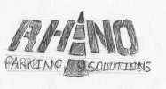
Just a sketch at the moment. But i think it shows promise
View attachment 1611
View attachment 1611


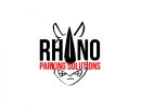
I know this might be crazy talk... but that 'I' looks like a rhino horn... could you shape it more like a horn than the dotted lines?
don't waste time with ghosted, it won't work at smaller sizes. Have you tried an 'outline' of the rhino head, imagine the 'head' being a shield or a badgeNeonThunder said:It's not crazy talk, your right about it ressembling a horn. I was trying to combing road markings with a rhino. A kind of hidden message logo lol it gives the feel of a rhino but it isn't a rhino. I've done a few more sketchs around this since then and also incorporated a rhino silhouette that's ghosted in the background. Post finalised ideas tomorrow.
")
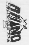
turn it to the left for a bit, should solve the problemscotty said:I like the one on the right but my neck hurts now.
live traced the one on the rightNeonThunder said:submitted these rough sketches to the client, also were having a meeting next week which is good. to discuss this and get working on the website layout. So all is good! Think it's time for a victory dance! :clap: :clap:
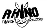
sketch1.jpeg sketch2 1.jpeg
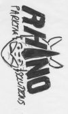
along with the sketch from previous posts and another which i can't find now!