You are using an out of date browser. It may not display this or other websites correctly.
You should upgrade or use an alternative browser.
You should upgrade or use an alternative browser.
Restaurant Brand Identity Critiques
- Thread starter MA1
- Start date
fisicx
Active Member
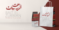
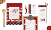
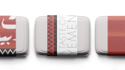
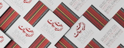
I’m assuming the Arabic script means something to Zemenese people? As does the cloth design.
Other than that, most of the products look disposable. Which means they could be spending a lot of money on items that go in the bin. We got a takeaway from an expensive restaurant on Friday. We only do this on special occasions (be cause it’s expensive). They use plain containers and no branding. In fact I can’t recall ever getting a takeaway with branding other than a pizza box.
Other than that, most of the products look disposable. Which means they could be spending a lot of money on items that go in the bin. We got a takeaway from an expensive restaurant on Friday. We only do this on special occasions (be cause it’s expensive). They use plain containers and no branding. In fact I can’t recall ever getting a takeaway with branding other than a pizza box.
Well it's a mock, so nothing is real.
I can't read most of it. L cannot tell even if the font choice his good.
Overall it's a brand identity but without context it's difficult to critique
@fisicx has a point though. My local takeaways have no branding. Just a menu in their shop. They don't even have a menu to take, they have literally taken a photo of a menu and put it on Facebook.
And they don't care.
Levi
Ultimate Member
I'm going to be honest the pattern looks 'African' to me. Now I'll admit I'm not familar with the yemenite culture, so it could be entirely accurate, but I doubt many others would be either so it's more about the 'vibe' it gives off when you look at it.
Personally I think the choice of font for the 'english' text is too thin, you'd struggle to read it from a distance and at least in the case of the bag it stops any potential 'advertising' you might get from it etc.
Personally I think the choice of font for the 'english' text is too thin, you'd struggle to read it from a distance and at least in the case of the bag it stops any potential 'advertising' you might get from it etc.


