SisterRosetta
New Member
Hi,
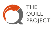
I'd really appreciate some critique on the following logo please (my first logo, so I'd really like to get it right!):


The brief - redesign the logo for an academic research project called 'The Quill Project'. The project focuses on the reexamination of historical negotiated texts (e.g. the American constitution) through a digital platform. I threw the old logo out of the window, but can post it if that helps. Should mention that the orange is one of their two key colours, grey just complementary.
Initial feedback from the client has been positive so far, with a few suggestions. What I'd really appreciate feedback on is:
Lucy
I'd really appreciate some critique on the following logo please (my first logo, so I'd really like to get it right!):


The brief - redesign the logo for an academic research project called 'The Quill Project'. The project focuses on the reexamination of historical negotiated texts (e.g. the American constitution) through a digital platform. I threw the old logo out of the window, but can post it if that helps. Should mention that the orange is one of their two key colours, grey just complementary.
Initial feedback from the client has been positive so far, with a few suggestions. What I'd really appreciate feedback on is:
- Are there any key symbols you see within it?
- Do you feel it fits the tone of the brief?
- How would you make the bottom right half look more 'modern'? Tried gradient/metallic, looked dreadful.
- Anything else you would change?
Lucy