Ram P. Mony
New Member
Hi friendly people !
!
Last month we had a logo design assignment (in Illustrator) to submit, and as we are encouraged to submit our draft designs for correction before submitting the final one, I ended up doing 5 attempts. Unfortunately, I still couldn't get it by the fifth attempt, and with less than 24 hours to before the final deadline, I submitted a totally different design, which was accepted - I got my grades!
But the Prof said he wants me to keep working on the previous design (not for grades) and show him a reworked one. However, I feel short of ideas how to go about improving/ modifying it. Any suggestions / critiques would be much appreciated.
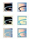
I am uploading the images of the 4th and 5th attempts at the logo. The basic idea is the letter 'G' with a river/ stream flowing through it. It was for a fictional company called 'Gurdara Graphics' - Gurdara is a persian word meaning 'dark river' (Gur = Dark; Dara = River).
This is the feedback the Prof gave me on the 4th attempt:
"I suggest trying to get the shapes to be defined by color and tonal contrast and not relying on the strokes. I suggest trying to work out the layout in B&W before adding any color. I also feel the "river" should not be of the same values or color as shown in the lower left."
This is the feedback he gave me after the 5th attempt:
"I still suggest making this work w/o the strokes. The one along the right side close off the negative space within the "G"."
I think I have either lost my way with the design or haven't quite understood what he meant
 . Any ideas/ suggestions/ critique would be very much welcome
 .
.
[EDIT - PDFs swapped with JPGS – Mod]


Last month we had a logo design assignment (in Illustrator) to submit, and as we are encouraged to submit our draft designs for correction before submitting the final one, I ended up doing 5 attempts. Unfortunately, I still couldn't get it by the fifth attempt, and with less than 24 hours to before the final deadline, I submitted a totally different design, which was accepted - I got my grades!
But the Prof said he wants me to keep working on the previous design (not for grades) and show him a reworked one. However, I feel short of ideas how to go about improving/ modifying it. Any suggestions / critiques would be much appreciated.
I am uploading the images of the 4th and 5th attempts at the logo. The basic idea is the letter 'G' with a river/ stream flowing through it. It was for a fictional company called 'Gurdara Graphics' - Gurdara is a persian word meaning 'dark river' (Gur = Dark; Dara = River).
This is the feedback the Prof gave me on the 4th attempt:
"I suggest trying to get the shapes to be defined by color and tonal contrast and not relying on the strokes. I suggest trying to work out the layout in B&W before adding any color. I also feel the "river" should not be of the same values or color as shown in the lower left."
This is the feedback he gave me after the 5th attempt:
"I still suggest making this work w/o the strokes. The one along the right side close off the negative space within the "G"."
I think I have either lost my way with the design
[EDIT - PDFs swapped with JPGS – Mod]


Last edited by a moderator:
