Request Critique of Accounting Logo

Caesari

New Member
Hi folks

This is my first post here but I've been observing the forums for a while.

I'm studying for my accounting degree right now and I've been doing a bit of graphic design as a hobby.

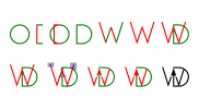
The approach I was looking for was to combine my initials (DW) with an arrow to represent growth.

I've attached four images: the main logo, two mockups and a breakdown of how I designed the symbol.

I'd be interested in your comments on its design and its suitability for the accounting sector.

Thanks for any feedback.

Regards

David
 

Attachments

  • 1 Stacked Logo.png
    1 Stacked Logo.png
    62 KB · Views: 19
  • 2 Ipad Mockup.jpg
    2 Ipad Mockup.jpg
    666.2 KB · Views: 17
  • 3 Business Card Mockup.jpg
    3 Business Card Mockup.jpg
    531.5 KB · Views: 12
  • 4 Design Breakdown.png
    4 Design Breakdown.png
    115.5 KB · Views: 21
Your initials are not WD it's DW.
It's the wrong way around.
Why not use the W as the growth arrow?

Looks like your solution to include the arrow in the D is backfiring because you cannot solve the problem of having the D first.

This is common in amateur designers, or hobbyists, shoehorning a solution to fit your agenda, rather than understanding the problem and solving it.


You've made some fundemental mistakes - too many graphics piled together.
Backward initials
An arrow that appears to have no purpose (not pointing at anything) - if you follow the semi circle with the arrow it makes less sense.
The name
Accounting is quite small
and those likes underneath

Too many details and graphics - less is actually more.

Try again - put your initials in the right order - you don't need a clever play on everything - be subtle
What do you want to be known as DW Accounting or David White Accounting
Hierarchy will be important to how you're presented.


After all that is said - it's a very good effort but I genuinely think you can do a lot better.
Hi, thanks for the comments. I'll take another look at it.
 
Your initials are not WD it's DW.
It's the wrong way around.
Why not use the W as the growth arrow?

Looks like your solution to include the arrow in the D is backfiring because you cannot solve the problem of having the D first.

This is common in amateur designers, or hobbyists, shoehorning a solution to fit your agenda, rather than understanding the problem and solving it.


You've made some fundemental mistakes - too many graphics piled together.
Backward initials
An arrow that appears to have no purpose (not pointing at anything) - if you follow the semi circle with the arrow it makes less sense.
The name
Accounting is quite small
and those likes underneath

Too many details and graphics - less is actually more.

Try again - put your initials in the right order - you don't need a clever play on everything - be subtle
What do you want to be known as DW Accounting or David White Accounting
Hierarchy will be important to how you're presented.


After all that is said - it's a very good effort but I genuinely think you can do a lot better.
Hi,

I've tried just concentrating on the W with the arrow (like you suggested) and removing the D from the symbol.

Thanks again.
 

Attachments

  • Test.png
    Test.png
    32.4 KB · Views: 3
It still doesn't work for me, it looks too contrived and awkward. Like Hank says, you're trying too hard to come up with something clever, but unfortunately you have
two letters that you can't really do anything with I'm afraid.
The only way I can think of is to have the W inside the D, but without the left hand stem of the D. That might work.
 
Actually, I've just tried it and it could still read as WD. I would stick with just your name. Unless you're known as DW as opposed to David, or you want your company
name to be DW Accounting, there's really no reason to have DW there.
 
Actually, I've just tried it and it could still read as WD. I would stick with just your name. Unless you're known as DW as opposed to David, or you want your company
name to be DW Accounting, there's really no reason to have DW there.
Thanks for the advice, Wardy!
 
Why not make your signature or something similar part of your logo? Makes it more personal. Esp as you are dealing with people's finances. Perhaps check out some handwritten fonts. Thus, ''David White'' could be in a handwritten font/signature and accounting using a classy sans serif font.
 
Hello to all,

My vision of this logo taking into account the original design.
 

Attachments

  • 2023-04-19_231552.jpg
    2023-04-19_231552.jpg
    125.1 KB · Views: 6
I bow to these two great professionals who despise the amateurs and who only know how to criticize without bringing any constructive solution, what a pitiful mentality!
You can delete my account, I've seen enough here.
 
I gave constructive criticism to the OP.
You came with a solution that went against all the other opinions so far - and I promptly examined the solution and figured it has just as many if not more issues as the original for all the same reasons.

We don't encourage others to attempt a logo construction - and encourage the OP to do the work. We don't allow others to post logo solutions as if David White decides he likes yours and takes it and uses it - will you want compensation for the work or a derivative of it?

You cannot really post examples of the logo - it wasn't requested anyway - nobody wanted to see your vision - we want to see the OPs vision.

We can comment on the OPs versions.
We cannot comment on your version - it's not even up for debate.

Completely pointless to even post it - and just confuses the OP.
 
Thank you for the explanations, I had no pretension with my proposal, rest assured, I will not post anymore and I even ask you to delete my account, thanks.
 
Your account won't be deleted. If you don't want to participate on the forums then don't.
Simple as that.
 
Back
Top