BenRichards
Member
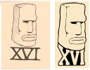
Basically, I did a logo for a friend's record company a while back. He then decided he wanted a new spin and something different to the norm so one of our friends drew up an easter island head (left).
Even though it was only a sketch, it had started to be used in publicising the label and the image has started to be associated with it, which is good, but its not a finished logo.
I was then asked to do something with it in order for me to do some artwork for some upcoming releases.
My problem was that I didn't want to change the image because changing the logo for a third time would damage the brand image and look unprofessional, i think.
What I have done so far is vectorised the sketch and added in some hand drawn type. This way it is still almost the same as the original in terms of image and style but hopefully looks a bit better.
The music style is electronic but the label has a very do it yourself style which is why I think he wanted something with a hand drawn style, even though its not my cup of tea.
My friend said he could draw up another/better head for me to use but I don't know if it would be worth it?
Please let me know what you think..
Granted, a lot of that might not make any sense..
(i have permission to use all images)