

BenRichards
Member
Hi,
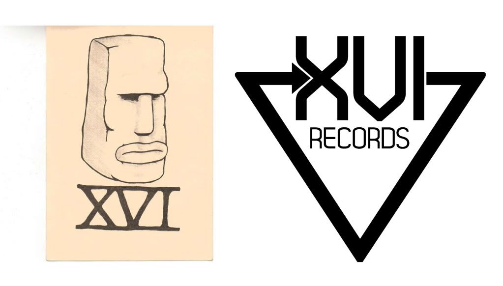
Basically I was asked to design a logo for a new record label based in London.
The label has some very talented names and a hell of a lot of potential.
It puts out music such as dubstep/house/electronic/funky/down tempo/"future beats"
I did the logo and it received a lot of good feedback but then the label started to use a different one. The main guy doesn't really know the score design wise but I don't want to try and seem like I am persuading him to use my work, even though i think it is better for the brand/label.
Here are the two logo's. Mine is the one on the right.
Let me know which one you think suits the most and any arguments I could put accross in my favour.
Cheers