

Corabict
New Member
hello everybody
I have a friend that own a small company for laser cutting, making wooden products and gifts. So my friend asked me to continue working on the brand.
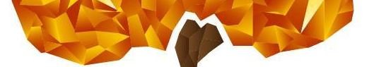
But they have a logo that's kind of strange to me, hence, I told him that we need to work on the logo and do another one, but he said he likes that one and that people know their product with the logo . although the logo on screen looks different than when it's engraved in wood. // I don't know if I'm allowed to upload an image of the logo. so I will upload a part of it. //
so the guy agreed to apply some fixes, like removing the shadow underneath the shape.
But I thiInk the color has a high contrast that's when it's added to a layout it kind of radiate pulling your eyes toward it and sometimes becomes annoying.
I want to know what are the limitation that will be caused because of this logo, and if you were me would you insist on changing the logo or, would you maybe change the color and work from there??
I have a friend that own a small company for laser cutting, making wooden products and gifts. So my friend asked me to continue working on the brand.
But they have a logo that's kind of strange to me, hence, I told him that we need to work on the logo and do another one, but he said he likes that one and that people know their product with the logo . although the logo on screen looks different than when it's engraved in wood. // I don't know if I'm allowed to upload an image of the logo. so I will upload a part of it. //
so the guy agreed to apply some fixes, like removing the shadow underneath the shape.
But I thiInk the color has a high contrast that's when it's added to a layout it kind of radiate pulling your eyes toward it and sometimes becomes annoying.
I want to know what are the limitation that will be caused because of this logo, and if you were me would you insist on changing the logo or, would you maybe change the color and work from there??

")