Scarlettolivia90
New Member
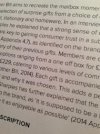
Im trying to figure out if this is a problem with the font or the printing.
I have been using Proxima Nova Light, and when printing some text the capital letters and numbers look slightly bold in comparison to the other letters.
Is this a font issue or a print issue?
I know my printer was having trouble when I recently collected my work,
but the problem seems too consisent to be a printer issue,
but I'd also be surprised that this font is printing so stragely.
any advice would be greatly appreciated


