Price has no bearing on logos

amac

New Member
Does anyone else agree with me here?


I wrote about this after reading an article in the FT where the author writes:


The game also makes me understand why it matters so much to get the design of the logo right. The good news is that this has little to do with money. The new BT logo – a globe – cost about £5m, but is something I could not identify at all. The Wikipedia logo – another globe – is instantly recognisable and cost almost nothing.


I've paid very little for the logo for my startup and I'm delighted with the result. I've heard of stories where people have paid huge sums and have been bitterly dissapointed. I guess with any creative process, you are not guaranteed a good outcome.
 
I'm glad you didn't pay a fortune for your logo, in fact if you paid anything over £30 ask for a refund. That would have been all of 10minutes work. It's not an awful logo but it is the most predictably boring result and the typography is shocking. With a domain as powerful as "Lion" I would expect a strong, memorable logo. Do a google image search of "lion logo" and tell me how you stand out form the crowd in a professional way?

I do agree with you that a great logo doesn't have to cost the Earth but it should cost something above "pocket money" figures. You are not simply paying for someone to draw - it is about reasearch, knowledge and expertise. A lack of understanding of what a real graphic designer does is ultimately what makes people turn to these "logos for £25" sites. Yes big corporations often spend small fortunes but what you are failing to address is that the big buck projects are branding exercises which are about the culture of a company as a whole. (There is a lot more to it than that but here isn't the place for a discussion of the process).

I'm not saying I am the best logo designer ever, far from it. In fact I don't even think I am anywhere as good as some of the people on this forum but I do have a lot of training, experience and the skills to provide the type of results that my customers appreciate and come back to me whenever they have new projects. For one of the logos on my site I earned £3000 - the most I have ever earned for that type of design but that too was part of a organization-wide branding package and entailled a number of weeks in the making.

I'm not quite sure what the point of your post was other than to attract people to read your blog? SEO exercise maybe? What I can tell you is you have neatly aligned yourself with crowd-sourcing and cheap price logo sites and that wont win you any friends among the graphi design fraternity.
 
To some extent I agree; a high price doesn't always make for a great design, and a low price doesn't mean poor quality.

Ultimately though I think it comes down to wether or not someone wants to pay for a logo, or hire a designer to create one for them. Those two situations are not the same, and the latter involves a great deal of time (amongst other things) to be invested in the project by the designer, hence the higher cost.
 
I agree with spotty on some points. You do have a very powerful domain name which should have something stronger than what's there at the moment (I could critique it but that's not the point of your thread). I also agree with the OP that price has no bearing on a good logo, it doesn't. What decides whether you end up with an identity that lasts 50 years or a piece of tat, is the quality and experience of the designer you use. Paula Scher of Pentagram drew the citibank logo in 5 seconds on a napkin but as she said, "I didn't draw the logo in 5 seconds, I drew the logo in 35 years and 5 seconds"

Though I have to say the price of logos is a really fucking tedious debate that seems to happen a lot... if you don't think it's important then pay nothing, if you want something decent and lasting, pay a decent sum of money. /end
 
Bit harsh Spotty, surely a lot of this comes down to style difference and taste, simple doesn't have to mean cheap!? Some of the most famous eye catching brands were the most simple to produce. The problem with graphics is it's very similar to the fine art world. It's completely subjective no two people agree and that's good as it gives the client a greater choice to styles to go with, if we all plopped out of Uni following every lesson to the letter and style we'd all be working for Vistaprint! Every person is different and every designer is different it doesn't make them less of a designer.
 
I'm not trying to be intentionally harsh. My stance is borne from the fact that is so hard to compete in this industry especially in light of "off the shelf" logos that, in my opinion, belittles the hard work a designer does working with a client developping a logo. I can't tell you how many times I have been told "you're joking mate? I can buy one online for £30". I personally don't think it is appropriate to start a thread about how great cheap logo places are when they have nothing to do with a real design process. Glorified clipart really.

I agreed that a logo doesn't have to cost a fortune, I also agree with your point that design is totally subjective but the whole nuance of the OP came across as graphic design is hugely over priced. It's hard enough to explain our costs without public opinion being swayed into a train of thought that we are all rip off merchants.
 
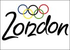
2 great examples..... nike logo cost summit like £25 and the london 2012 logo cost 400k!
 
I wrote an article on my blog about this last week. There is a place for this type of design but the concern that people are using it as an alternative to quality design. If you want a quick logo and you want to get your business cards printed by Vista then theres nothing wrong with that, each to their own. The problem comes when people (businesses) are using crowdsourcing sites to get design on the cheap. And it's working in their favour at the moment.
 
I'm with SpottyPenguin all the way on this one unfortunately. I think (the majority of the time) you get what you pay for. You want a good service, you pay a good price. It does matter what you pay for a logo. Like SpottyPenguin has said already, the original poster's logo cost £30 and to be honest, it looks like a logo that could have been crowd sourced/bought for that price. It's not aesthetically displeasing, but, I think you can tell the thought process isn't there. A vector of a lions face next to the word lion, how very original.

Yes, it's a logo, yes, it cost £30 and does a job without looking completely naff, but, for me, a logo is the starting point of branding and therefore it has to do a job detailing a brand. All I can gather from the Lion logo is that, the company is called lion and maybe they like the colour blue? There's not any more thought or logic to the job than that I don't think. It definitely doesn't conjure the thought of Lion as the "go to online news portal" which is probably what the OP is trying to create.

With time and money invested into it, the logo would have been developed more, which in turn develops the brand further to convey more of the brands ideals. That's what a logo is to me and to get that, it takes investment. Design is an investment and should be looked as such.

In response to NUGFX's comments:

Fair enough, the Nike logo allegedly cost £25, but all of the promotion, branding, tv advertising, and targeted campaigns that make you realise that the Nike tick symbolises Nike the brand, definitely weren't all thrown in there for £25. That will have cost millions. Nike didn't have a brand for £25, they had a logo mark, that's it. They had to build the brand for more money, so, why not just invest it from the off. I don't think a logo and a brand identity are separate things. You need both, or, your logo has nothing to say.

As for the London 2012 logo. For me, it works. They've created a talking point, it's bright, it's energetic and full of life, much like the games themselves. Therefore, I think it works.

Sorry for rambling.
 
As for the London 2012 logo. For me, it works. They've created a talking point, it's bright, it's energetic and full of life, much like the games themselves. Therefore, I think it works.

Im actually with you Tony. The Olympic logo in my opinion isn't as bad as what people make out. In fact I think it's quite clever, but maybe it's a little bit too clever, and that's why people jump on it. Theres a thin line.
 
There is a thin line. Something else I was thinking about the Olympic logo. Just like the random Cadbury advert with the gorilla and the drumming, it's got people talking about the end product, which, basically, is what people are trying to achieve. Also, everyone knows it and can recognise it instantly. So surely, that's the logo being successful?
 
Essentially yes but how much of that logo-awareness derived from people seeing the naughty Simpsons element? Either way, as you say it has done its job
 
There is a thin line. Something else I was thinking about the Olympic logo. Just like the random Cadbury advert with the gorilla and the drumming, it's got people talking about the end product, which, basically, is what people are trying to achieve. Also, everyone knows it and can recognise it instantly. So surely, that's the logo being successful?

In fairness, the Olympic Games is unlikely to slip under the radar whatever imagery is appended to it: a cock and balls or a swastika would get people talking and tickets for the egg and spoon heats would still sell out in a couple of hours...

I remember it being suggested when the 2012 logo was launched that, although people didn't 'get it' at the time, they'd come to appreciate it over the years running up to the games themselves. I thought at the time that this was a pompous and patronising excuse for an inexcusably bad logo which was apparently designed to fit Lord Coe's notion of 'youth' (which, one assumes, was gleaned from extensive research into the kind of thing the aforementioned 'youth' were spray-painting on East London bus shelters at the time). Five years later, I'm still claiming a win for my point of view.

One can easily imagine the organising committee putting together a brief making liberal use of the word 'funky': "Yeah - 'Funky'... like The N-Dubz", says one. "Or like Tim Henman", says Seb.

Anyway...
 
I still don't mind it. Admittedly it could have been better, but I don't think it is as bad as people have made out. To be honest anyone with a bit of creativity could take a logo and make it look like something else to amuse the masses. It's just that this logo is a global talking point and that's why it has been torn apart like it has. I mean we can't have people thinking we actually like it can we?! They must see our disapproval!

I can live with it.
 
Yeah it was going to garner the attention of the masses anyway, no matter what it was. Like Ian says though "I can live with it".
 
Back
Top