Preference for display of digital portfolio printwork

milkminnie

New Member
just looking through prospective freelancers portfolios, that have be forwarded my way lately. There is a definite variation of how people are displaying their print work on their websites. Some take angled shots of the printed media, others upload the digital artwork to screen. What way is favored at the moment (pics examples if you like). As im going to be the person controlling the website side of things now, id like to display the work in a flattering/favored way.
 
I've always liked the angled shots but haven't had the resources to do so before now. That said, I think combining both is ideal so that you can have a look at the actual print version (which always comes out much better than on screen) whilst also take a look at the whole piece rather than just what is visible from that angle.

Also, it may then help for clients to see how the screen version translates into print and, therefore, how any designs they may receive could look better still once actually printed up.


What about logos? I have seen people do them on like a shaded background, or some printed out and shot on a letterhead
 
I think they can be specific to the business and placed onto various still shots e.g. place the logo on a coffee cup if it's for a coffee chain etc. Aside from that, I quite like the shaded background.
 
I'd definitely say photographing all printed work is the best way to go about it. To me, the images are bits of work in themselves, not just stuff put onto your site. If of course you don't have the resources for that, then using the digital design is the next best thing. But I hate it when people just put the design on a white background with an ugly dropshadow. At least take the time to find some interesting background, a wooden floor, or a wall or something to put the design on.

I like the mix and match approach with logos. Show the digital design, then photography of it applied to other media.
 
Definitely a fan of photographing printed work. This is where the beauty of the work actually shows through and I think adds a level of legitimacy to a portfolio.

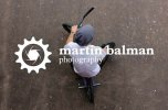
As for logos, I'm playing around with adding a background to the designs. This one for example is an older logo I did for a friend that actually uses his photography as the background.

MartinFinal.jpg


I think it makes it a little more interesting to look at rather than just the design on a white background.
 

Attachments

  • MartinFinal.jpg
    MartinFinal.jpg
    48.3 KB · Views: 0
Back
Top