mrp2049
Senior Member
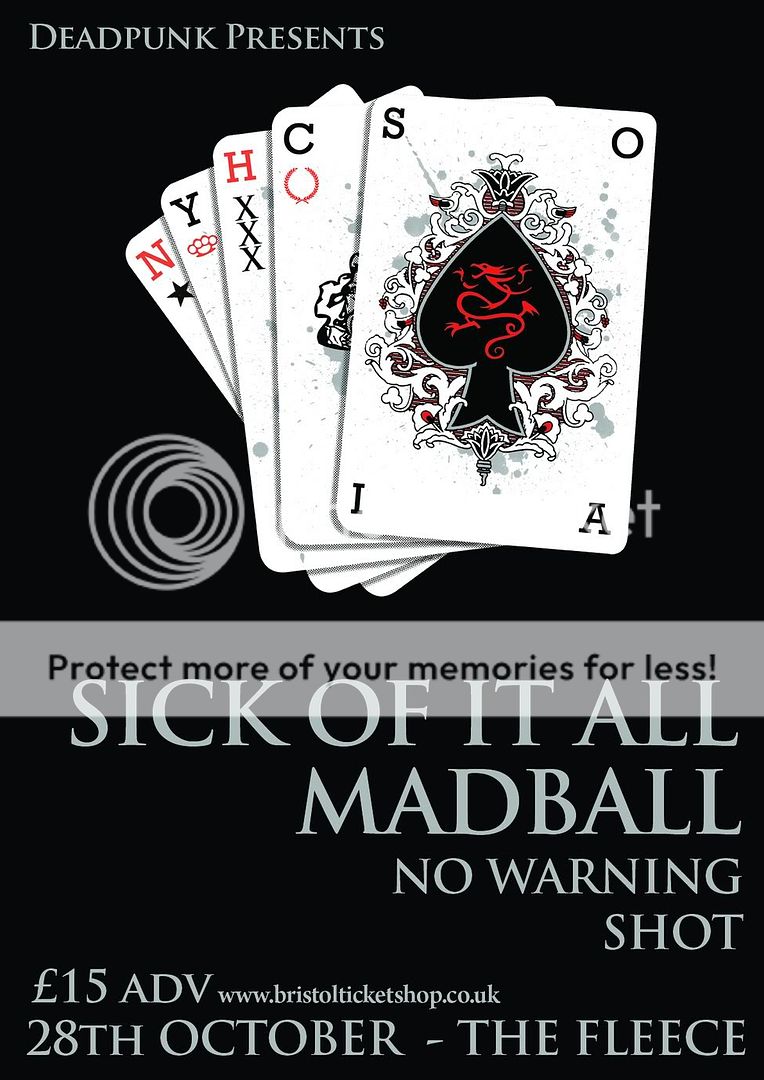
Right gentlemen, I am at that point...to add detail or not to add.

This is a 3 colour screen printed poster and I have used 3 colours in the minor details of the playing cards, and it seems a shame to not take advantage of that throughout the detail of the design, yet I have hit a wall, where I can't think of what to do.
What can I do to improve it whilst keeping it within the feel of what I have done so far?
I've hit the wall. I'm going to eat dinner and come back!
