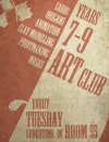
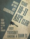
Hi everyone =) Well basically my school's art department commissioned me to create 2 posters promoting the school art clubs and soo I created these xD They've already been put up around the school but I was wondering what all of you awesome designers on here think of them and if there's anything that I can improve =) I'm not too sure if they stand out enough and if the typography's ok but it's the first time i've tried to create posters so any advice would be really appreciated!
You are using an out of date browser. It may not display this or other websites correctly.
You should upgrade or use an alternative browser.
You should upgrade or use an alternative browser.
Poster critique!
- Thread starter Kai16
- Start date


Paul Murray
Ultimate Member
I like them actually, I love the retro/vintage colour.
I'm not keen on the clipart paintbrush in the 2nd one though, and I don't know if the horizontal text is working with the rest of the type being at an angle but they work, and they're certainly not eyesores
I'm not keen on the clipart paintbrush in the 2nd one though, and I don't know if the horizontal text is working with the rest of the type being at an angle but they work, and they're certainly not eyesores
Tony Hardy
Well-Known Member
Yeah I love the colour choices and the texture of the pieces. They work really well.
For some reason I can't find the button to edit my post xD but i forgot to say that I also put the elements in to try and make the posters look more like they were for art clubs, and that I didn't put the same elements on both posters because I wanted to target different year groups =) If that makes sense!
I see what you're saying but they look a bit like an afterthought to drive the message home. If I were revisiting it with this in mind, I'd probably try to communicate the art thing a bit more overtly (but still subtly) by making the light diagonal strip on the right-hand side (or maybe the coloured one on the left - not sure) look like it had been done with a paintbrush (something like this: Photos.com - Photos.com | License and Download 94502949 Today.).
That said, I don't think it's necessary.
That said, I don't think it's necessary.
I see what you're saying but they look a bit like an afterthought to drive the message home. If I were revisiting it with this in mind, I'd probably try to communicate the art thing a bit more overtly (but still subtly) by making the light diagonal strip on the right-hand side (or maybe the coloured one on the left - not sure) look like it had been done with a paintbrush (something like this: Photos.com - Photos.com | License and Download 94502949 Today.).
That said, I don't think it's necessary.
Hmm yeah I guess they do a bit now you mention it. Thanks for the advice and the idea of making the strip look like it was painted! I'll try it out at some point =)
yourmailman
New Member
i haven't got any critique really, just wanted to say good job, really like them. great design, colour scheme. nice one
i haven't got any critique really, just wanted to say good job, really like them. great design, colour scheme. nice one
Thankyou! =)