You are using an out of date browser. It may not display this or other websites correctly.
You should upgrade or use an alternative browser.
You should upgrade or use an alternative browser.
Please help select logo from 3 options (women’s shoe label)
- Thread starter shoelabel
- Start date
@GCarlD
Well-Known Member
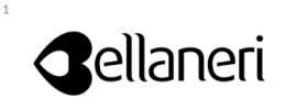
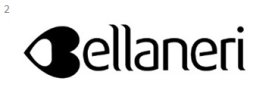
2 but I don't think any of them are quite there yet. The shapes for the B isn't working properly. I like the idea of bring two shoes together to form the B and also depict a heart shape but it is not instantly recognisable as a 'B.' If you didn't tell me the brand, I would of thought it was called 'ellaneri.' I think you need to revisit the shape or maybe include the negative spaces inside the letter 'B' to make it clear. Or use some colour to kind of outline the B and match it with the rest of the letters.
Just out of interest, what font is that? It's lovely.
Just out of interest, what font is that? It's lovely.
2 but I don't think any of them are quite there yet. The shapes for the B isn't working properly. I like the idea of bring two shoes together to form the B and also depict a heart shape but it is not instantly recognisable as a 'B.' If you didn't tell me the brand, I would of thought it was called 'ellaneri.' I think you need to revisit the shape or maybe include the negative spaces inside the letter 'B' to make it clear. Or use some colour to kind of outline the B and match it with the rest of the letters.
Just out of interest, what font is that? It's lovely.
Thanks for the comment. Very insightful. I wonder if others feel the same about the legibility of the logo as Bellaneri and not ellaneri by recognizing the B. I will have to ask my designer what is the font used and get back to you.
Thanks again!
ARRIVALS
Well-Known Member
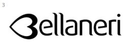
Number 3 looks more shoe like than the first 2, but then again, it also looks more like the view you'd get looking down at a girls chest .. I'm not keen on the font either. It reminds me of the font you'd find on an Indian takeaway leaflet. I'd like to offer something constructive, but can't really. It's far from finished. Did your designer show you anything else?
@GCarlD
Well-Known Member
Number 3 looks more shoe like than the first 2, but then again, it also looks more like the view you'd get looking down at a girls chest .. I'm not keen on the font either. It reminds me of the font you'd find on an Indian takeaway leaflet. I'd like to offer something constructive, but can't really. It's far from finished. Did your designer show you anything else?
That is a very good point actually, the font does have an Indian restaurant feel to it. It is still a nice font but probably not suited for your brand. Have to disagree with number 3 though, as the shape is least recognisable as both shoes and the letter 'B.'
Paul Murray
Ultimate Member
I agree with Dave, I don't think any of them are working. They all look like a sideways heart followed by "ellaneri" to me.
darrengraphicdesign
New Member
Go for 3
I agree with Dave, I don't think any of them are working. They all look like a sideways heart followed by "ellaneri" to me.
What Paul said ^^^
Paul Murray
Ultimate Member
That's looking much more legible. The only comment I have is that the B still looks a little too detached from the rest of the type. Perhaps making it thinner or the rest of the type thicker to match will help tie the two together.
@GCarlD
Well-Known Member
That is definitely the best so far. But the thickness of the 'B' should be the same as the rest of the letters. Apart from the font which was mentioned before, the only other criticism would be that the 'B'/mark looks even more like a heart shape now and not at all like a pair of shoes - whether that is intentional or not I don't know. It doesn't scream women's shoe label to be, if I didn't know before hand I'm not sure I'd of guessed it was for that. But as I said it is the best so far.


