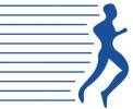
please give an opinion on my logo

poots

New Member
Hi

I'm designing a logo for my brother's fitness company. We now have two candidate for the final logo. Could you please give me an opinion on which you prefer and why.

I've attached two images, one of each logo.

Just for the survey could you please state if you're male or female.

Your responses will be much appreciated.
 

Attachments

  • logo 1.jpg
    logo 1.jpg
    51.2 KB · Views: 49
  • logo2.jpg
    logo2.jpg
    81.6 KB · Views: 51
Hi,

I Prefer what you've done with the second logo. I would play with the kerning of the text and get rid of the lines above and below the running man. Also it would be good to have the logo on a white background as this is how it would appear on a letterhead ect.. maybe adjust the size of the character so that it is the same size of the text?
 
I agree with Arthur - the second one is infinitely better - the colours are better - the muted blue is easier on the eyes against the black and is less....'standard' than that.. well, i call it 'corporate blue' which you see everywhere. It's more versatile and won't date. The wiggly lines above and below the runner make it look a bit 1980s though, and it would look much better without them. Just to be really nitpicky - i know it's a stylised image but I'd make his forearms bigger as they look a quite disproportionate to the rest of him/ his legs:
a reference image to show you what i mean

hope I haven't come across as a big meany, because it does look good - just needs a couple of little tweaks to make it pop imo :)

edit:
ps. I'm a girl.
 
Last edited:
Thank you both very much for your replies. They are well appreciated. Excluding the two of you, I've asked about 12 people, and I'd say 8 went for the second one (as you did) and four went for the first.

Those who went for the first generally felt it was much more attractive and attention grabbing, whilst those who went for the second felt it was more corporate and professional looking. I also had suggestions to take of the top and bottoms lines as both of you have said.

And Tash, i definitely take your point on the disproportion between the arms and legs - i'll be adjusting that.
 
I also prefer the 2nd one as it is simpler/less fussy than the 1st, however I feel that the 'be fit today' should be as one, then maybe have the image after the word 'today' - i feel it would flow better.. I also think if u wanna stick to using the horizontal lines in the logo then the end of each line should wrap around the man much more cleanly and with even space between each line and the man, if that makes sense? :/

I am female :p


something like this:

gg.jpg

Hope u get my point... u see here the edges of the lines run parallel with the edge of man! (excuse my rough sketch :p)
 
Back
Top