SWATTDesign
Member
I've completely rebranded my design studio recently, and now am just updating the template I use for pitching for large contracts.
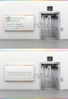
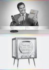
The feedback I had about my old pitch template was that it was not very interesting or engaging for the reader, so I decided to add full size image covers to the document, but I'm struggling. I've got three concepts that I really like, but all the people who I've asked opinions from as which one they prefer have left me even more confused - my partner even went so far as to say he didn't like any of them :Cry:!!
The idea behind each concept was to take the word "pitch" and come up with some different way of visually presenting it - so I've got an elevator (elevator pitch), the cheesy 40's retro salesmen (which I think is kind of fun and is on trend at the moment), and a baseball pitcher (a bit more abstract and possibly a bit big headed and not sure if UK clients will get it, but is my favourite visually). I've numbered in the order that I like them, but every time I go back to this project I end up arguing with myself for and against each one and can't make up my mind!!!!!
Any comments, suggestions, preferences would be much appreciated. I've got a couple of pitches lining up that I'd like to get this sorted for so really need to get on and make a decision.
Thanks guys
Sam
