You are using an out of date browser. It may not display this or other websites correctly.
You should upgrade or use an alternative browser.
You should upgrade or use an alternative browser.
Photomedia Project
- Thread starter lizzyrach
- Start date
Paul Murray
Ultimate Member
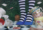
Mixed perspectives is an issue with photo manipulations, as is inconsistent lighting. Saying that you've done a pretty good job, but I think you need some harder, solid shadows to ground the objects – beneath the shoes for example. I'd also play around with slightly blurring some of the objects in the foreground/background to try and mimic focal range.
Thanks Paul. I'll give that a goMixed perspectives is an issue with photo manipulations, as is inconsistent lighting. Saying that you've done a pretty good job, but I think you need some harder, solid shadows to ground the objects – beneath the shoes for example. I'd also play around with slightly blurring some of the objects in the foreground/background to try and mimic focal range.
Hi Lizzyrach,
I really like the concept for this project, however I have to agree with Paul on this one - the differences in lighting between each piece is letting you down a bit. If you can re-shoot or modify the lighting on some of the elements to make it more consistent (in both direction and degree of hardness), that would really help to allow the eye to focus more on the composition and appeal of the image itself.
I really like the concept for this project, however I have to agree with Paul on this one - the differences in lighting between each piece is letting you down a bit. If you can re-shoot or modify the lighting on some of the elements to make it more consistent (in both direction and degree of hardness), that would really help to allow the eye to focus more on the composition and appeal of the image itself.
