Paul Murray
Ultimate Member
I'm torn between two options for an identity I've been designing for a personal trainer. Her initials are LD, and her company name is LD Fitness.
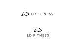
This is my original idea...
This is a refined version with the LD dropped from the type and the mark itself forming the initials that someone suggested is a better, cleaner option.
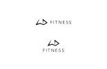
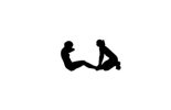
I agree with it being cleaner, but I feel it's losing the company name this way, it just seems to say "Fitness". Also, the mark itself is based both off her initials, but is also intended to be an abstract representation of a trainer and a trainee: The left 'figure' (L) represents someone performing a sit up, whilst the right 'figure (D) represents a trainer applying weight to their legs to aid them, like this...
I feel it needs her initials in the type. What do people think?
This is my original idea...

This is a refined version with the LD dropped from the type and the mark itself forming the initials that someone suggested is a better, cleaner option.

I agree with it being cleaner, but I feel it's losing the company name this way, it just seems to say "Fitness". Also, the mark itself is based both off her initials, but is also intended to be an abstract representation of a trainer and a trainee: The left 'figure' (L) represents someone performing a sit up, whilst the right 'figure (D) represents a trainer applying weight to their legs to aid them, like this...

I feel it needs her initials in the type. What do people think?